How To Make A Letterhead
Now more than ever, businesses are turning to premium printed letterhead for their formal documents. Having consistent business stationery doesn’t just keep you organised, it promotes your competency and care as a company.
You don’t need to be a professional designer to make a letterhead. From specialist arts software to Microsoft Word, we’re going to show you how to make a letterhead design of your own.
What is a letterhead?
A letterhead is a formal header and footer, featuring on important company documents. Having a letterhead shows the viewer that a document is important, coordinated, and associated with a particular business.
Typically, letterhead is printed in bulk at an experienced printer, on a premium paper stock thicker than office paper. When needed, the letterhead is overprinted with document details on your home or office prints.
It is therefore important for your paper of choice to be compatible with your office printer. To test this, we recommend ordering a sample.

What should you include on a letterhead?
Knowing what to include on a letterhead will help you along when making your design. You want to be sure that all the necessary contact details are present, without over cluttering the page. Think about what your clients need to know about your business. Who are you and how do people contact your company?
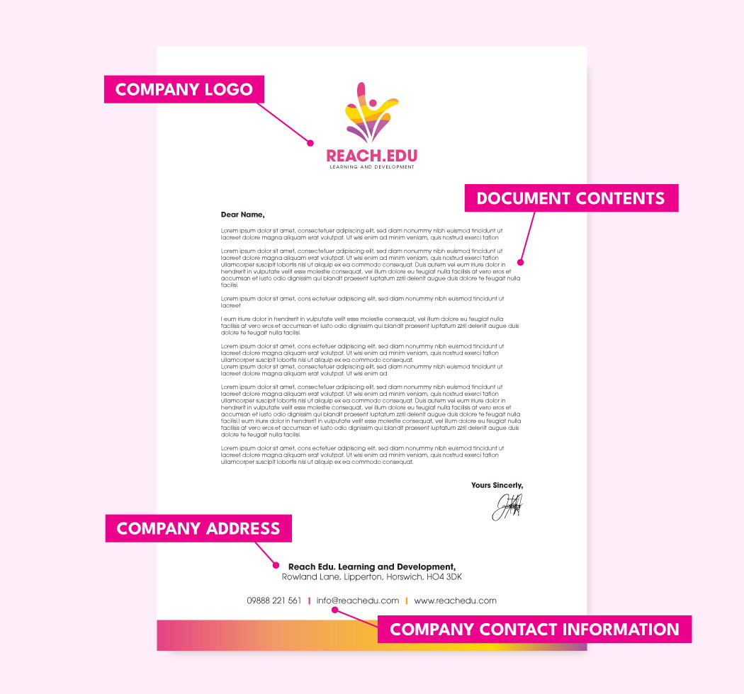
Most letterhead designs include the following information:
- Company logo
- Phone number
- Email address
- Website
- Company address
- Company registration number
- Contact name (if applicable)
- Social media (if applicable)
The above list won’t apply to all businesses. A law firm will require different information compared to that of a junior dance company, for example. Keep your brand image in mind and you’ll find that narrowing down the contact info to include will be easy.
How to set out a letterhead?
Before we begin designing, it’s time to think about the letterhead layout. Like most designs, letterhead has a hierarchy. Crucial information will be included towards the top, moving down to information of lesser importance. Most businesses choose to include their logo first to introduce the viewer to the document owner straight away.
After a business logo, other information like phone number, email address, and website are featured. Your phone number will be expected over a physical address if your business is primarily online. And your website won’t be necessary for a report shared within your company.
Think about who will be looking at your documents and what they need to know about your business. We recommend using a sheet of paper to create a plan for your letterhead hierarchy before getting stuck in with designing.
What is the best way to make a letterhead?
There are many ways to make a letterhead, from using a letterhead template to creating your artwork from scratch. The best way to make a letterhead is to use a technique that works for you. And if that means using Microsoft Word, then go ahead!
Here are some ways to make a letterhead design with letterhead examples:
How to design a letterhead in Microsoft Word?
You don’t need to have state of the art design software to make a letterhead design. Microsoft Word has a whole range of features that you can use to create a professional letterhead, personalised to suit your business.
First, let’s look at the letterhead templates that Microsoft Word has at its disposal. Open Microsoft Word and head to the search bar. Type into this search bar “letterhead” and you will be met with all the letterhead templates Microsoft Word has to offer. From fun, colourful designs to the more minimal, there’s something for everyone.
In this letterhead example, we’ve gone with the financial business letterhead.

Clicking your design of choice will open it up in Word for you to adjust. From there, you can start to change the template, tweaking it to better fit in with the rest of your business stationery.
Your template of choice will come with a colour theme. These are the colours that complement the current design but may not match those of your business. Go to Design > Colours to see the different colour themes available in MS Word. If none of these combinations takes your fancy, you can always pick out your own colours.
In this letterhead template, the shapes at the bottom are in the document footer. To edit the footer, go to Insert > Footer > Edit Footer or double click into the footer at the bottom. Then select the shapes, Right-Click> Group > Ungroup. This will allow you to edit each shape individually.
Then open Shape Format > Paint Bucket Tool and choose new colours for your bottom shapes.
Next, it’s time to change the logo. The logo in this letterhead template is in the header. Double click in the header or go to Insert > Header > Edit Header. Select the logo and delete it. Then go to Insert > Pictures > From This Device and select your logo. All you need to do then is scale your logo to fit your letterhead layout.

Logo and shapes added, you can now add your information and you’re all set. Save out your design as a PDF to get your design printed by an experienced printer.
How to design a letterhead in Adobe Illustrator?
A specialist design program, like Adobe Illustrator, allows you to get a bit more creative with your letter head design. With more graphic design tools for you to use, you aren’t restricted in what you can make.
The first thing you need to do after opening your Illustrator file is to add some guides. The guidelines will help to prevent anything from landing too close to the edges of your document. Add guides by going to View > Rulers > Show Rulers. From there you can drag your guides onto the artboard and position them along each edge. We recommend that your guides be at least 12mm from each edge.
Now it’s time to make your company letterhead. Using the text tool you can add your contact information, change the font, and the colours. Then, insert your company logo and any other images you’d like to use in your design. All that’s left is to adjust your design to match your business brand identity and you’re all set.
Don’t forget to keep some white space in the middle of your artboard for your document contents to go.
How to design a letterhead in Adobe InDesign?
Adobe InDesign is the perfect place to create a letterhead layout that is organised and formal. Enter InDesign and open a new document. In the document set up, change your margins to 12mm. Once your document is open, the margins will show you where to keep your design elements to prevent any disruption to the document text.
Now you can start to add your text and images. Use the text tool in the left hand panel to insert some text. Adding a logo and other images is also pretty simple. Under File > Place, find your images and insert them into the document. For any text, select the text icon in the left hand panel, draw a box, and type your text.

To use your letterhead design in Microsoft Word, save your InDesign file out as a PDF. Then, open Word, go to Insert > Object > From Text File, and choose your PDF. This will convert the PDF to be editable in Word.
In this example, we did have to move some of the elements around when brought into Word, so don’t be too worried if it doesn’t look identical to your InDesign file.

Litho printing vs digital printing: which is better for a letterhead?
After creating your letterhead design, it’s time to get it printed. This is when you can think about whether to choose litho printing or digital printing. Let’s briefly look at the difference between the two.
Litho printing is used for printing Pantone colours. The colour is first created and then applied to a plate matching the design. This plate is applied to the paper, transferring the colour design.
Colour is incredibly important in litho printing, with each mix being carefully controlled to produce a specific tone that can be replicated across a wide range of prints. Businesses that value brand consistency will often choose litho printing as it provides greater colour accuracy.
Digital printing takes the four colours Cyan, Magenta, Yellow, and Black Key (CMYK), and blends them to create the final print. These colours are mixed inside the printer itself, reducing the cost per print compared to litho printing.
The choice of printing method depends on what your company needs. If you require a specific spot colour, then litho printed letterhead is for you. And if you need a quick yet professional set of headed paper, digital printing is the number one choice.
Learn more about litho printing vs digital printing here.
Print your letterhead designs with Aura Print
Letterhead is intended to provide an elevated look to your documents but what is a wonderful letterhead design without a beautiful print finish? At Aura Print we have a stunning selection of paper types, carefully chosen from our extensive paper library. From eco-friendly papers to something a little more textured, we have it all.
Want to know more about letterhead printing? Check out our letterhead printing or get in touch with a member of the team today.

 USA
USA FR
FR
