USA
USA FR
FR


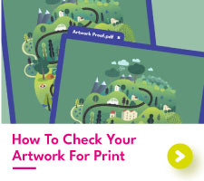

How to check your artwork for print
Preparing artwork for printing can seem daunting, especially if you're new to the process. But with the right guidance, it's a straightforward process. This step-by-step guide will walk you through the essentials of print set-up, including how to check a PDF is print ready.
A print-ready PDF is a digital file that's optimised for professional printing. It guarantees accurate colour reproduction, sharp images, and flawless text. By following a few simple guidelines, you can create print-ready PDFs that will produce stunning results.
Artwork Format for Printing: Understanding Print Terms
When preparing artwork for print, there are some crucial elements worth knowing about! Understanding what a bleed area is and how to work within a safety margin will help you on your way to getting your designs perfect for the printing presses, so stick with us to learn exactly how to prepare artwork for printing.
Consider Size and Scale
The size of your artwork should match the size you wish to print, plus a bleed area which we will cover shortly. We recommend choosing the size you want to print before starting to design your artwork. If you have already created your artwork before picking a size, you may have some rearranging to do.
There are some exceptions to setting up artwork to the size you want to print. Larger prints like custom size banners and bespoke printed wallpaper are often metres wide and simply too large to create at the full size. Attempting to set up a huge canvas will either crash your design software or leave you with a monster of a file that your printer will struggle to work with. In cases like this, making your designs half or a quarter of the size will be fine.
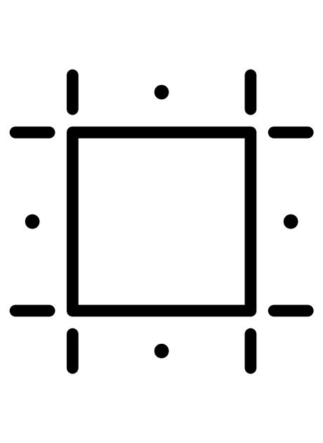
Setting a Bleed Area
A bleed area is an essential part of your artwork format for printing, but it is often missed from design files. At Aura Print, we need your artwork files to have a 2mm bleed area along each edge.
Having a bleed area is like having a safety net on your artwork. Without it, your final prints run the risk of having thin, unprinted edges, which isn’t very flattering. Your bleed should seamlessly match the rest of your design, for it may appear within the final trimmed prints.
What your bleed area should not be is a block colour that does not match the rest of your artwork. If you are struggling with the bleed artwork format for printing, we recommend adding a border that extends into your artwork. This will prevent any unsightly, unprinted, or mismatched edges from appearing.
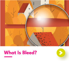
Bleed
We recommend a 2mm bleed area along each edge of your artwork, with the design extending smoothly into the outside area.

Correct Bleed
Bleed Missing
Bleed Doesn't Match
Apply Safety Margins
Within print, you may hear the terms “margin” or “safety margin”. This is often mistaken for a bleed area but is something different entirely. We need a 3mm safety margin on most of our printed products. There are some outliers which we will discuss below.
A safety margin sits within your design and is intended to act as a guide to prevent any important parts of your artwork from being too close to the edges. Text and printed borders are typically crucial to your designs, but what happens when wording ends too close to the final edge? It runs the risk of being trimmed off.
Our printed playing cards have an increased safety margin of 5mm. Unlike most prints, which are designed to be seen individually, playing cards and custom tarot cards are intended to be viewed as a complete set. A higher safety margin helps to keep your card decks uniform, preventing noticeable differences between cards.
Our premium banners also have a different safety margin, this time at 50mm. As banners are meant to be hung up for display, eyelets are punched into the material to provide a place to attach it to a wall or fence. The last thing you need is for text or photographs to be obscured by one of these eyelets. So, keep anything important 50mm from each edge.
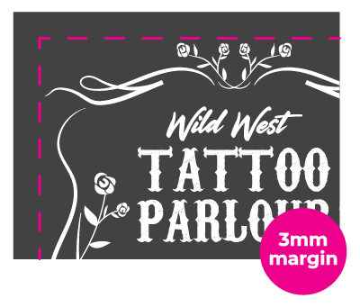
3mm Margin
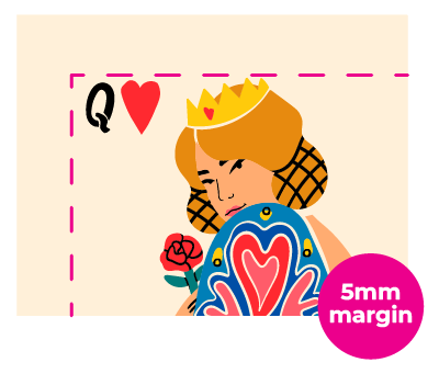
5mm Margin

50mm Margin
Margins
We recommend a 3mm safety margin for most of our prints, 5mm for playing cards and 50mm for banners.
A Quick Guide to Image Resolution
If your design consists entirely of vector graphics, resolution won’t be a concern. As discussed, vector images can be scaled to any size without compromising on quality, however most designs include some raster elements, where resolution becomes a key consideration.
Resolution is measured in DPI (dots per inch), which indicates how may individual dots or pixels fit into a one-inch space when printed. To simplify, think of DPI as a measure of pixel density. For example:
- A 100 DPI image has a pixel density of 10,000 pixels per square inch.
- A 300 DPI image boasts a pixel density of 90,000 pixels, resulting in much sharper detail.
For print purposes, a higher DPI is typically preferred to ensure maximum quality.
- Standard print quality: Aim for a resolution of 300 DPI. At this level, individual pixels are undetectable to the naked eye, delivering a clean, professional result.
- Large format prints: For larger pieces like posters and banners, 150 DPI is generally sufficient, but 300 DPI is fine too. These prints are usually viewed from a greater distance, where slightly lower resolution won’t affect visual impact, however our awesome wide-format printers pop out your banners at a whopping 720 DPI!
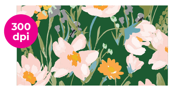
300 DPI
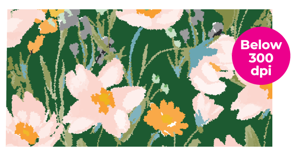
Below 300 DPI
We recommend a resolution of 300 dpi for print. Anything below will result in pixelation / blurring.
Getting Resolution Right: Program Guide

Adobe Photoshop:
To check the resolution of a Photoshop file, go to Image > Image Size. If you open this box and it already states 300 dpi you should be good to go.
But if this tab states anything lower, do not just change the figure to 300 dpi. This will not increase the quality of your already-made artwork, unfortunately. If only it was that easy!
Instead, you will have to start a new document, and before doing anything else, set the resolution to 300 dpi. Then you need to make your design again. Yes, it’s a pain, but the final printed results will certainly be worth it!

Adobe Illustrator:
If you have created your artwork from scratch in Illustrator, chances are the resolution will already be 300 dpi or above. This is because Adobe Illustrator is a vector-based program, meaning the images created are smooth, crisp, and suitable for print.
To check the resolution of your Adobe Illustrator document, go to Window > Document Info and then click on your image. If the figure shown in the pop-up window is below 300 dpi, it might be worth searching for a different image to use.

Canva:
Canva doesn’t have a special, built-in feature to check the resolution of your designs. Instead, it is up to you to check the quality of the images you wish to use. Elements from Canva’s own library will be of high quality to print. But images you bring in from outside the program may be a different story.
We recommend only using high-resolution images when working in Canva. To see the resolution of an image in Windows go to File Explorer > Right Click the Photo > Properties > Details. In Mac open the image in Preview > Tools > Show Inspector.

Direct From Photo:
Modern cameras can produce images of a much higher resolution than what is needed for print. The benefit of this is that you don’t have to worry about image pixelation in printing. If you are using your phone or an older camera, be aware that the resolution might be lower simply due to the type of camera you are using.
To check the resolution of your images, we recommend uploading them to your computer. Then for Windows go to File Explorer > Right Click the Photo > Properties > Details. For Mac, open the image in Preview > Tools > Show Inspector. This will bring up a window showing your image size and resolution.
From there you can decide whether you are happy with the image resolution or if it’s worth trying to get a higher-quality image.
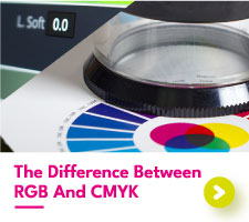
Colour
Colour is incredibly important in print, with specific shades making or breaking the overall look of a design. In digital printing, the colour mode used is always CMYK so we recommend sending over your artwork in CMYK.
We know it can be tempting to create your digital artwork in RGB, but artists beware! RGB is designed for screens, not for print, with printed colours being unable to match the bold and vibrant tones that can be shown on a monitor or phone screen. We recommend converting your artwork to CMYK so you can judge whether you are happy with the colours produced.
With spot colour printing on products like spot colour business cards, we need your Pantone colour to be set up as a spot colour, with the Pantone reference code in the name.

CMYK
Cyan, Magenta, Yellow and Black (Key) are used in digital printing

Pantone
Cyan, Magenta, Yellow and Black (Key) are used in digital printing

RGB
Red, Green, and Blue are used on screens and are not suitable for print
File Formats
The final step of preparing artwork for print is picking the file type.
When preparing artwork for print, the file format you choose is critical and often depends on the design software you’re using. For optimal results, we suggest working with publishing tools or vector-based software such as Adobe Illustrator or InDesign. Regardless of program, the software you use must support exporting images in either the CMYK or RGB colour model – don't worry though, we dig into all that on our dedicated guide to choosing between CMYK and RGB!
While image editing software like Photoshop can technically be used to create and export artwork, it’s not ideal for print. Photoshop produces raster images, which are composed of individual pixels. These can lose clarity when resized, especially for larger formats.
For print-ready designs, vector graphics are typically the better option. Unlike raster images, vectors rely on geometric shapes, ensuring crisp, high-quality visuals that remain sharp no matter the size. Tools like Illustrator or InDesign are built for creating and handling vector graphics, ensuring they’re industry standard.
That said, raster images still have their place. For example, photos and certain types of complex graphics are best handled in raster files. If you've created a raster-based design in Photoshop, you can import it into vector-capable software like Illustrator or InDesign to complete your project.
Understanding when to use vector or raster graphics can make all the difference in achieving professional-quality prints. Here’s a quick breakdown of what each format is best suited for:
Vector
- Logos
- Icons
- Text-based designs
- Scalable graphics
Raster
- Photographs
- Detailed illustrations
- Complex textures or gradients
- Artistic effects like blurs
When it comes to file types, at Aura Print we accept a range of different types of files for print including:
- PDF files (Preferred)
- Adobe Photoshop, Illustrator, and InDesign
- EPS and SVG
- Jpeg
- PNG
Regardless of the image file you choose, don't forget the above artwork requirements for printing. We still need your bleed, safe margin, and colours converted to CMYK to be able to print your artwork.
Another question we often get is what to do if your file size is too large to submit via email. The Aura Print team can accept files via Google Drive, Dropbox, and other large file-sharing sites such as WeTransfer.
How To Create Artwork for Printing: Special Finishes
Ok, so you’ve got the fundamentals of print down, what’s next? Well, depending on the type of print you are looking for, you may have a bit more work to do. At Aura Print, we’ve got some special finishes and techniques that each have their own special artwork requirements for printing.
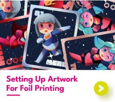
Metallic Foiling


We need one file with your foil design in 100% pure black on a white background. Your other file should contain your print design with no visible foil elements.
Metallic foil products such as metallic foil business cards, shimmering foil bookmarks, and shiny playing cards are created in stages, with your printed and foiled designs being applied at completely different times and on different machines. As the print and foil are applied separately, it only makes sense that your artwork is also separated for print and foil.
First comes your print file. We need that to be supplied as an individual file with any foiled areas removed. Try to avoid having duplicate areas on your print and foil file as this may cause issues down the line.
Next comes your foil file. This should only include the parts of your design that you want to be foiled in 100% pure black on a white background. Don't worry - we know which foil colour you want to apply as this will be visible to our production team based on your order.
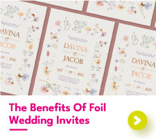
We have a dedicated post if you want to learn more about setting up artwork for foil printing.
Die Cutting
Custom shaped prints such as personalised die-cut flyers and die-cut stickers differ from standard prints as their shapes are anything but standard. Although your shape may not be a typical square or rectangle, the artwork format for printing should still include a bleed area and safety margin.
Other than that, we need one more important thing from you. The shape of your print! Our team needs to know the shape you want them to cut your artwork to. Sending over a file with a 1pt stroke in the shape you want cutting is all we need.
Without this cutline, our team will be back in touch to ask you what shape you would like (unless it’s something obvious like a circle). So, save yourself the back and forth by sending over your cutline with the rest of your artwork files, but before that why not learn the difference between die-cutting and kiss-cutting?


We need one file with your print design and another file with your cutline as a 1pt stroke. Do not include your cutline on the same file as your print.
Raised and Flat Spot UV
Adding a glossy layer over the top of your print is a wonderful way to add a subtle highlight. When it comes to preparing artwork for print with spot UV, whether that's custom spot UV business cards or something else entirely, we need an extra file from you with your spot UV design separated from the rest of your print.
Your spot UV design needs to be spot colour pink, ideally labelled as “Clear”, on a different file to your print. Having duplicate designs on your print and UV file is absolutely OK as the spot UV is clear and shows any print underneath.


We need one file with your spot UV design in spot colour pink labelled "clear". The other file should contain your print design.
Metallic Gold and Silver Inks
Metallic inks differ from metallic foil, both in appearance and print technique. Where metallic foiling requires multiple print machines, metallic inks can be run on the same print press as the typical CMYK.
Your metallic ink design needs to be spot colour pink, labelled as either “Gold” or “Silver”. We recommend removing the metallic ink design from your print file and only having it on your metallic ink file.


We need one file with your metallic ink design in spot colour pink labelled "gold" or "silver". The other file should contain your print design.
Spot Colour / Pantone
Pantone printing has a unique set of artwork requirements for printing. The area you want to print as Pantone must be set up as a spot colour with your Pantone reference as its name. Our printers will print the colour that matches this reference number so make sure it matches your artwork design.
With spot colour Pantone printing on products such as spot colour business cards, the only colours visible on your designs should be the Pantone shade. We cannot print Pantone and CMYK together. Anything set to CMYK or not as a spot colour will not appear on your final print.

Your Pantone colour should be set up as a spot colour with the correct Pantone reference code as the spot colour name.
What Happens During the Proofing Stage?
For each order placed through Aura Print, you’ll be given the option to receive a digital proof from a member of the design team. As part of this digital proof, our team will check your artwork files to determine whether they have met the required artwork guidelines for printing. If anything seems amiss, we will get in touch with you with our recommended changes to get your files just right.
We know that getting your files print-ready isn’t always easy. If you are struggling with how to prepare artwork for printing, request our team to do it for you. With our “Supply brief and we design” service, our team can get your artwork up to scratch to ensure the best-printed results. Keen to learn how to put together a great design brief? We have a guide for that, too!
When all is said and done, the products you receive should be at their very best because they’re representing both yourselves and us. Reach out today and let’s make your printing journey the best it can be!