USA
USA FR
FR


Digital Printing on Coloured Paper
In the pursuit of finding your perfect colour combination to complement your desired design, all may not be as it seems. In this article, I want to help break down some common misconceptions surrounding ink and different colours and shades of paper. As you will see, different types of paper have different characteristics that give them altering ‘natural’ shades, and then there’s our excellent GF Smith Colorplan range, deliberately made to add some straight-up background vibrancy to your prints. Maybe you have a certain colour theme for your upcoming wedding? This is where Colorplan can be used to create bespoke wedding stationery tailored to your needs.
But just before we get into the colours we have available, let’s peruse the potential problems if you were to try and print some designs at home. What would be the pitfalls, and what we do to ensure you get nothing short of the best quality? (Shameless plug, but well deserved!)
Myth: Ink is Opaque
If you were to take a standard desk jet printer and pop in some Blue card stock, you would see that once the print begins to pass into the output tray, you would probably see that the dark shades of ink don’t totally block out the blue stock, leading to a washed out look. This will also apply to alternate stocks such as rustic Kraft paper, wheat and cannabis. In addition, a home printer can only print up to a certain weight (roughly 160gsm) so the definition of the ink and paper will be weak and look washed out.
How To Get The Most From Your Designs When Printing On Coloured Cardstock
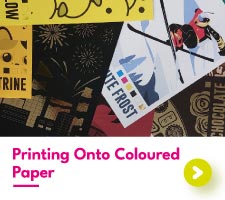
When printing on colourful paper, there are a couple of important things to keep in mind when creating your designs. Remember that we do not print white. Any white space within your designs will not be white when applied to the GF Smith paper of your choice. Instead, they will be the colour of your chosen paper.
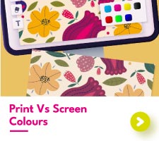
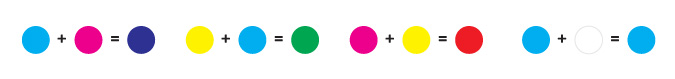
Full-colour printing onto colourful paper will result in your designs taking on some of the colours from that paper. Depending on your design, this can make a huge difference to the overall appearance of your print. The main thing to be affected by this is full-colour photographs, here’s a handy infographic to break that down.
With white paper, the see-through nature of the toner isn’t obvious. This is due to a white background essentially being “empty”, allowing the coloured toners to mix without any disruption. GF Smith paper, on the other hand, provides an extra colour for the toners to mix with. Now instead of cyan and magenta joining to make purple, cyan, magenta, and the colour of the paper background will mix. This will leave you with a colour that is usually much darker than what you intended.
Printing Onto Coloured Paper
The last thing we want is for you to be disappointed in your coloured paper prints. This is why we have split our GF Smith selection up into three parts based on what kind of printing they are most suitable for.
Toners used in print are semi-translucent. This allows the colours the blend to create all the right shades. It also results in the toner taking on the colour of the paper underneath.
Printing onto white paper doesn't change the overall colour of the designs.
This is because the toner does not take on any of the white of the paper.

Printing onto coloured paper does change the overall colour of the designs.
The toner blends with the paper colour to create a new shade.
The darker the paper and the lighter the print, the more dramatic these changes will appear.
Introducing Our GF Smith Colorplan Range
GF Smith Colorplan is an absolute game changer when it comes to colourful printed paper. With its striking colour selection and no white edges, there's no doubt why so many gravitate towards this coloured printing paper. However, printing with GF Smith paper is not always as straightforward as it may seem.
We have many shades of GF Smith Colorplan papers in our collection. From the palest of pinks to the richest of blacks and everything in between, there’s a lot to cover. Let’s get started with our lightest GF Smith papers.
Lighter Shades: Full-Colour Companions
Our lightest Colorplan shades feature 8 different colour tones. This group of papers are light enough for full-colour printing, with little to no effect on the final printed colours. Of course, there will always be differences in colour from the screen to the print. But with these coloured printing papers, that difference isn’t too detrimental to your designs.

White Frost
Okay, so White Frost isn’t technically a colourful printed paper - it is white after all. However, White Frost is still part of the GF Smith family so it would be a little mean to leave it out of this lineup. White Frost is a pure and strong white paper. If you are looking for semi-textured white paper for your painting and decorating business cards, White Frost is the one for you. Being white, this paper has the least overall effect on the appearance of printed colours.

Natural
As the name suggests, Natural paper has a “natural” look.
This GF Smith paper has an unbleached appearance, being more of an off-white tone.
If you are looking for a light, rustic paper for your business stationery, Natural is the perfect choice.

Real Grey
Real Grey is the first of 2 grey GF Smith papers we have up for grabs.
This paper shade is a muted grey, light enough for full colour printing but not so light to be mistaken as white.
Real Grey is the ideal background if you are searching for sleek and classic branded print materials.

Azure Blue
If you are searching for a true baby blue for your baby shower invites, let us direct you towards Azure Blue.
With just a touch of icy blue, Azure Blue is a wonderfully delicate blue shade of GF Smith.
Of the three blue papers we have available, Azure Blue sure is the softest in tone.

Lavender
Soft and calm, Lavender GF Smith paper wouldn’t look too out of place in a summer’s lavender field.
This lighter purple shade is one of the three purple tones featured in this list.
Lavender paper is a lovely choice for designs embracing the feminine, with printed belly bands being a top pick here in the studio.

Candy Pink
Candy Pink is a confectioner’s dream. At the palest of pinks, Candy Pink is the lighter of the two pink shades we have available.
Much like Azure Blue, Candy Pink is another great choice for baby shower invitations, being a beautifully soft baby pink in colour.

Sorbet Yellow
Whoever over at GF Smith named this paper Sorbet Yellow got the description bang on.
With a muted yellow colouring, never has a paper looked so delicious. Our favourite choice for Sorbet Yellow Colorplan is full-colour backing cards.
What better way to display your enamel pins than with a colourful printed paper backdrop?

Stone
The last of our lighter GF Smith Colorplan papers, Stone is the darkest shade in this group.
A true beige, Stone paper provides a neutral background to your printed designs.
If you are on the lookout for a paper with a rustic feel that isn't too dark, Stone will be right up your street.
Medium Colours: Black Print Friends
This next group of coloured papers are too dark to take full-colour printing. The colour changes are too great, so we've removed that option altogether. Black print, however, provides a stunning contrast to each of these paper shades, making it the best choice for your prints.

Factory Yellow
Factory yellow is a true yellow, incredibly bright, and a great background for black print.
Being yellow, this paper colour creates such a contrast with the black print - it is an absolute delight to see.
Making a statement with your prints is easy with such a bold colour as a background.

Citrine
Landing right in the middle of yellow and orange, Citrine is less of a pure orange but nowhere near a true yellow.
All our GFSmith Colorplan papers can be double-stacked to create thick business cards, with Citrine being one of our customer favourites.
With its colourful hue, business cards with Citrine edges are hardly going to be forgotten.

Bright Red
Bright Red is exactly what the name suggests.
It is red and it is bright! Of the two red shades we have available, Bright red is more of a true red.
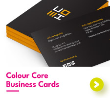
This GF Smith Colorplan paper is a wonderful choice for the centre of our colorcore business cards, with the eye-catching red showing along the sides.

Scarlet
If Bright Red is pure red, then Scarlet is a deep, rich wine red.
Scarlet is the darker of our two red coloured papers, making it the classier of the duo.
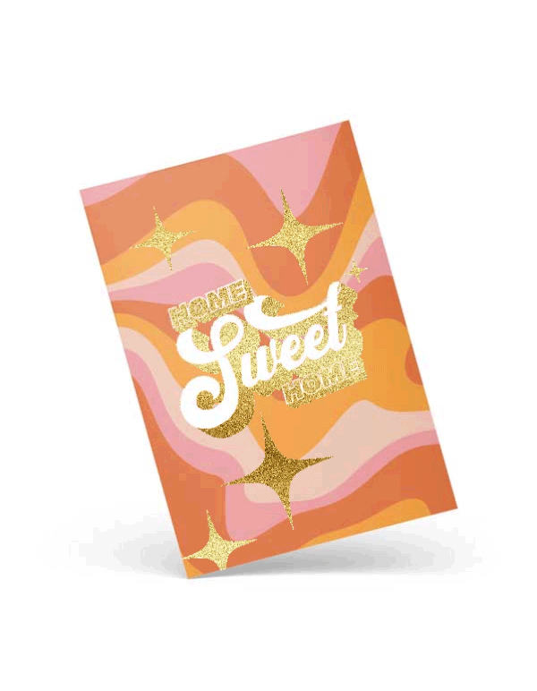
This Colorplan paper is a great pick for gold foil Christmas cards, with the gold foil popping against the red background.

Fuchsia Pink
This bold pink paper is the standout from our two pink papers.
Fuchsia is the closest you’ll ever get to a neon pink on paper.
If you want to upgrade your marketing materials with a distinctive pink tone, then Fuchsia Pink is the one for you.

Purple
Our Purple GFSmith paper is the second of our three purple papers.
This shade of purple sits right in the middle of light and dark, making it the ideal mid-toned paper.
If you’re looking for inspiration for this paper colour, then look no further than holographic foil bookmarks.

Tabriz Blue
Tabriz Blue is a medium blue-toned Colorplan paper stock.
With a cyan background, you aren’t going to be able to find a truer blue elsewhere.
This Colorplan shade is a sure way to get your birthday invitations to stand out from the rest.
Just don't forget to keep your designs black.

Marrs Green
The last of our mid-toned colours, Marrs Green is a unique green coloured printing paper.
Marrs Green is not a traditional green, you could almost say it’s out of this world! The colour of the paper has a slight hint of blue to it, adding an interesting quality to the paper.
Getting this shade of green using print is difficult, so save yourself the hassle and go with a GFSmith Colorplan instead.
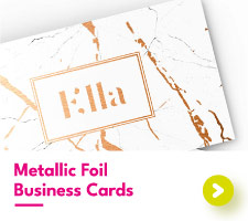
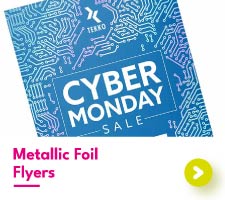
Dark Colours: Metallic Foil Fantasy
This final lineup includes only the darkest shades of GF Smith Colorplan. Being so dark prevents these papers from showing any print. Instead, it's metallic foil's time to shine. There's still plenty of choice when it comes to your designs, with many unique foil-printed products to pick between.

Forest Green
Forest Green never disappoints when paired with metallic foiling.
This dark green paper is the right choice for woodland-themed wedding invitations, providing a deep, beautiful green background to match your special day.
Our favourite foil combinations with Forest Colorplan are gold, copper and silver, the classics of course.

Sapphire
Sapphire GFSmith paper is the last of our blue-coloured printing papers.
With a navy blue tone, this Colorplan paper is a staple within our paper collection.
A creative choice for this Colorplan paper is foiled envelopes. What better way to customise your foil invitations than with sparkling envelopes to match?

Amethyst
The final purple paper in our lineup, Amethyst provides a royal purple background for your designs.
Although all our foil colours look great with Amethyst, we love it when people step outside the box and try our pink and purple foils with this paper colour. It’s an absolute treat for our studio.

Bitter Chocolate
Out of all our GFSmith papers, Bitter Chocolate is our only real brown.
Bitter Chocolate is a cool-toned brown, with a dark and slightly muted appearance. Our personal favourites for this coloured printing paper are foiled certificates.
The brown background combined with our gold or copper foil is a dream to see.

Dark Grey
Bordering on black, Dark Grey is our second grey colourful printing paper we have to show.
Dark Grey is a neutral-toned grey, making it ideal for corporate booklet covers and foiled tickets.
If you like dark paper but don't want to go all the way to black, Dark Grey is the best choice.

Ebony
And finally, the last coloured printing paper in this list.
Ebony is, understandably, our most popular Colorplan paper. With its midnight black colour, this Colorplan paper is perfect for all kinds of printing projects.
From foiled playing cards to gold foil bookmarks, Ebony can be found almost everywhere.
If you want to get your hands on our GF Smith Colorplan papers as well as our equally impressive range of metallic foils, you can order our colourful sample pack here. Once you get to experience the colours first-hand, you’ll understand why we’re such a popular choice!
Come to the colourful side!