USA
USA FR
FR


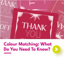

Colour Matching: What Do You Need To Know
Colour Matching: What Do You Need To Know?
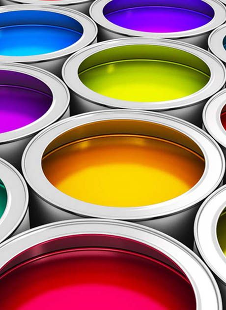
Colour – it’s something that can make or break your design. Whether you’re sticking to a strict brand guideline or wanting to capture your audience with your digital artwork, getting those all-important colours right is key.
If life was simple, you could print the same file, on any printer at any time, with no difference in the colour produced. Unfortunately, life is not simple, and neither are printed colours.
Instead, colour matching is used by printers to improve consistency across different print machines, paper types, and other special finishes. But how do you know whether you need to request colour matching from your printer?
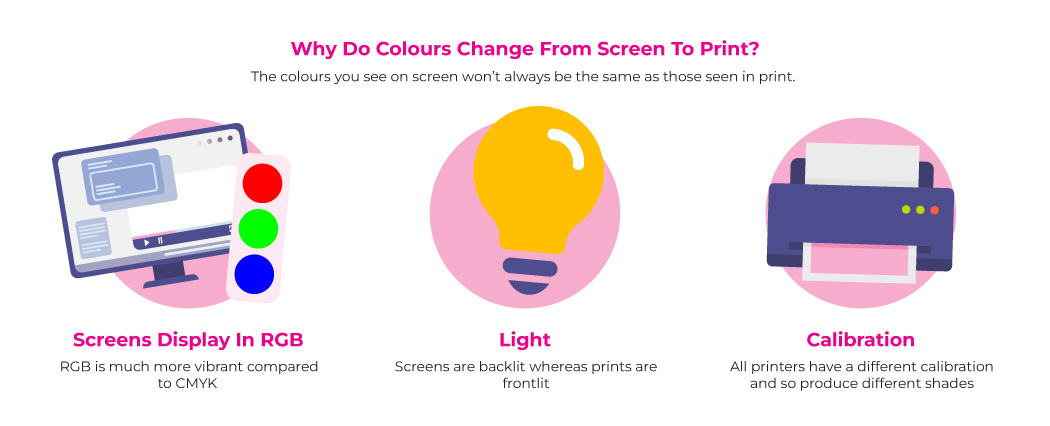
Why Do Colours Change In Print?
Before we get to colour matching, we need to know why colours change in the first place. You might think that a certain colour should be fixed, that it should always look the same no matter when and where it is printed. This simply isn’t the case.
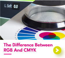
In digital printing, the colour you see on screen and the colour you see in print will be different. Why? Because the colour mode used on a screen is RGB, whereas in digital print it is CMYK. RGB and CMYK both produce different colour values, and although there is some overlap between the two, there are also great discrepancies. More on those below.
Factors such as temperature, humidity, lighting, and machinery can all affect the look of a printed colour. Print staff understand that these external influences can alter colours, which is why calibration tests are performed daily to help improve consistency. However, this won’t always stop colour changes from happening.
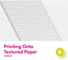
Another thing that affects the appearance of a colour is the material it is printed on. Glossy paper has a better surface for the bold and bright compared to textured card. Picking the right paper type is essential to achieving colour printing perfection.
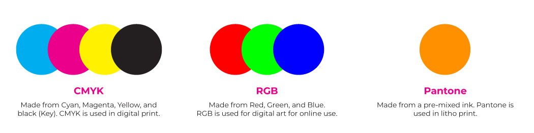
What Is The Difference Between RGB, CMYK, and Pantone?
In the world of colour, there are many groups, modes, and reference codes, that come together to form the rainbow spectrum of distinctive colours we know and love. Understanding where each group should be used will give you an advantage when designing and printing your artwork.
Starting with CMYK, this group of colours is made using Cyan, Magenta, Yellow, and black (Key). Using different values of these 4 colours will leave you with a range of shades, from the palest of pinks to the deepest of blacks.
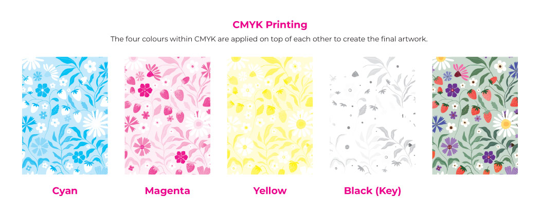
CMYK is typically used in digital printing and has quickly become the printer’s favourite in recent years. Using CMYK is a cheaper method of printing for the colours do not need to be pre-mixed before being applied to the paper. Each of the four colours is applied individually, coming together to form the completed image.
Next, we have RGB. Arguably the most diverse of all the colour modes, RGB is practically unmatched with its huge catalogue of hex codes at its disposal. Although it is only made from three colours (Red, Green, and Blue), RGB can form over 16 million unique colour tones!
Understandably, this makes RGB popular for online artists and businesses wishing to recreate strong and bold colours. RGB is used on screens and monitors only, with the incredible range of colours being difficult to replicate in print.
Finally, we have Pantone. Spot colour Pantone is used within litho printing and is created using a pre-mixed ink. These pre-mixed inks are identified using their Pantone reference codes, with your printer needing this code to produce your Pantone colour of choice. Much like RGB, Pantone spot colour can produce a greater variety of colours compared to CMYK.
Pantone is designed to produce the same, if not incredibly similar, colour tones across coated and uncoated papers. This makes it the best choice for businesses wanting to perfectly replicate their brand colours across their print materials. Being a pre-mixed ink, Pantone is carefully controlled and regulated to ensure consistency within print. This does make Pantone the more costly print method.
With these differences in colour groups there inevitably will be differences in printed colours. CMYK sometimes just cannot keep up with RGB and spot colour Pantone, often producing a more lackluster version of a beautiful colour seen on the screen.
How To Convert Colours Into CMYK?
If you want to print digitally, you’re going to need to convert your colour mode to CMYK if it isn’t already. Changing your colours to those found within CMYK will give you a better representation of your final prints, avoiding any nasty surprises when you see your prints in person.
How To Convert To CMYK In Photoshop?
When you make a new Photoshop document, you will be given the option to choose your colour mode. Picking CMYK allows you to design using the same colours as those used in digital print.
If you have already created your artwork and want to convert to CMYK, going to Image > Mode will bring up the option for CMYK. Selecting CMYK will change the look of your document, most likely dulling the colours. This is unfortunately unavoidable for CMYK is much more limited than RGB and other on-screen colour modes.
The best way to perform colour match Photoshop would be to use the CMYK colour mode in your design. That way, if your printer recommends adjusting your file to produce a colour match, you will be able to do so with ease.
How To Convert To CMYK In Illustrator?
Like Photoshop, Adobe Illustrator will also give you the option to work within CMYK when starting a new document. To change the colour mode of an already existing artboard, go to File > Document Colour Mode > CMYK. Switching to CMYK will most likely dramatically affect the look of your designs, meaning you may have some adjusting to do.
How To Convert To CMYK In Canva?
Although Canva doesn’t technically have the option for you to work in CMYK, you can always download your files in CMYK after you’ve finished designing. To do this go to Share > Download > File Type > PDF Print > Colour Profile > CMYK (Best for professional printing).
Unfortunately, this option is currently only available for paid Canva users. For those of you out there using the free version of Canva, we recommend choosing your colours carefully. Anything extremely bright and bold should be ruled out for it will struggle to replicate in CMYK.
What Is The Pantone Matching System (PMS)?
As Pantone printing can only be done through expensive litho printing, businesses often look for a more affordable solution. The Pantone Matching System (PMS) was developed by Pantone to provide the CMYK values for each of the shades within their library.
Within the Pantone colour matching system, each Pantone is printed alongside their closest match CMYK colour. Of course, CMYK cannot always replicate Pantone perfectly. There are cases where a perfect match can be found and others where the two colours hardly look related.
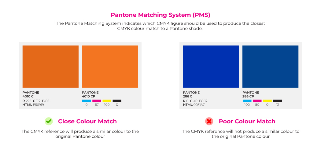
Although it is difficult to perform a Pantone colour match in CMYK, it isn’t always impossible. We recommend getting in touch with your printer with the Pantone colour you want to replicate in CMYK and they will let you know whether it can be done, or whether you might need to make some sacrifices on your final print colour.
What Is Colour Matching?
If you are after a specific colour in CMYK, your printer will need to perform a colour match to make this a reality. Performing a colour match is simple. First, your printer will need your artwork file along with a physical print of the colour you want to match.
Then, your printer will print out a colour swatch sheet. This swatch sheet will include varying values of CMYK, including the original values from your digital artwork file. Your swatch sheet will then be compared to the physical print, with the closest colour match being identified.
It is often the case that the identified colour from a colour match will have a different CMYK value than the original file. Your printer will let you know the value, allowing you to adjust your digital file before it is printed.
At Aura Print, colour matching is a service we readily provide for our customers. To request a colour match for your order, download and fill out this colour matching form.