What's The Difference Between CMYK and RGB
People of a certain age (me included) can remember a time when the senses were confined by limited visual technology. Put simply, we had to watch TV in black and white, and we only had 4 channels! But that’s a story for another time. When colour television burst onto the scene, you could appreciate a whole new layer for the senses. Colour injected life into visuals that we had only previously seen in monochrome and since the dawning of that technology, red, green and blue (RGB for short) have dominated the digital display colour scene.
Print however mainly uses a different approach to bring designs to life – namely, CMYK. But what exactly are these mystic methods of colour generation, how do they differ from each other and when should you choose one over another?
Follow me into a whole new world and way of thinking about colour!
Alright, let's dive into the fascinating world of colour modes! As the You.com Smart Assistant, I'm here to shed some light on the key differences between RGB and CMYK.
The Core Differences Between RGB and CMYK
The biggest distinction between these two colour modes is where they are applied. As I hinted earlier, RGB is the go-to for all things digital - websites, TV screens, and smartphone displays. It's an additive colour model, where red, green, and blue light combine to create a vibrant array of colours.
On the other hand, CMYK is the champion of the print world, used for everything from professional business cards to elegant wedding invites. This subtractive colour model relies on pigments like cyan, magenta, yellow, and black to produce a wide range of hues.


What Is a Colour Gamut
A colour gamut specifically relates to the scope of colours that you can work with. To help with this, popular editing software such as the Adobe suite and others have included a warning system if one of your colours becomes “out-of-gamut”. It will appear as a triangle with an exclamation mark in your colour picker tool to inform you that your chosen colour may not print accurately in CMYK. Professional programs will suggest a similar colour to apply that fits within the CMYK gamut, nifty huh?
The Primary Colours Showdown
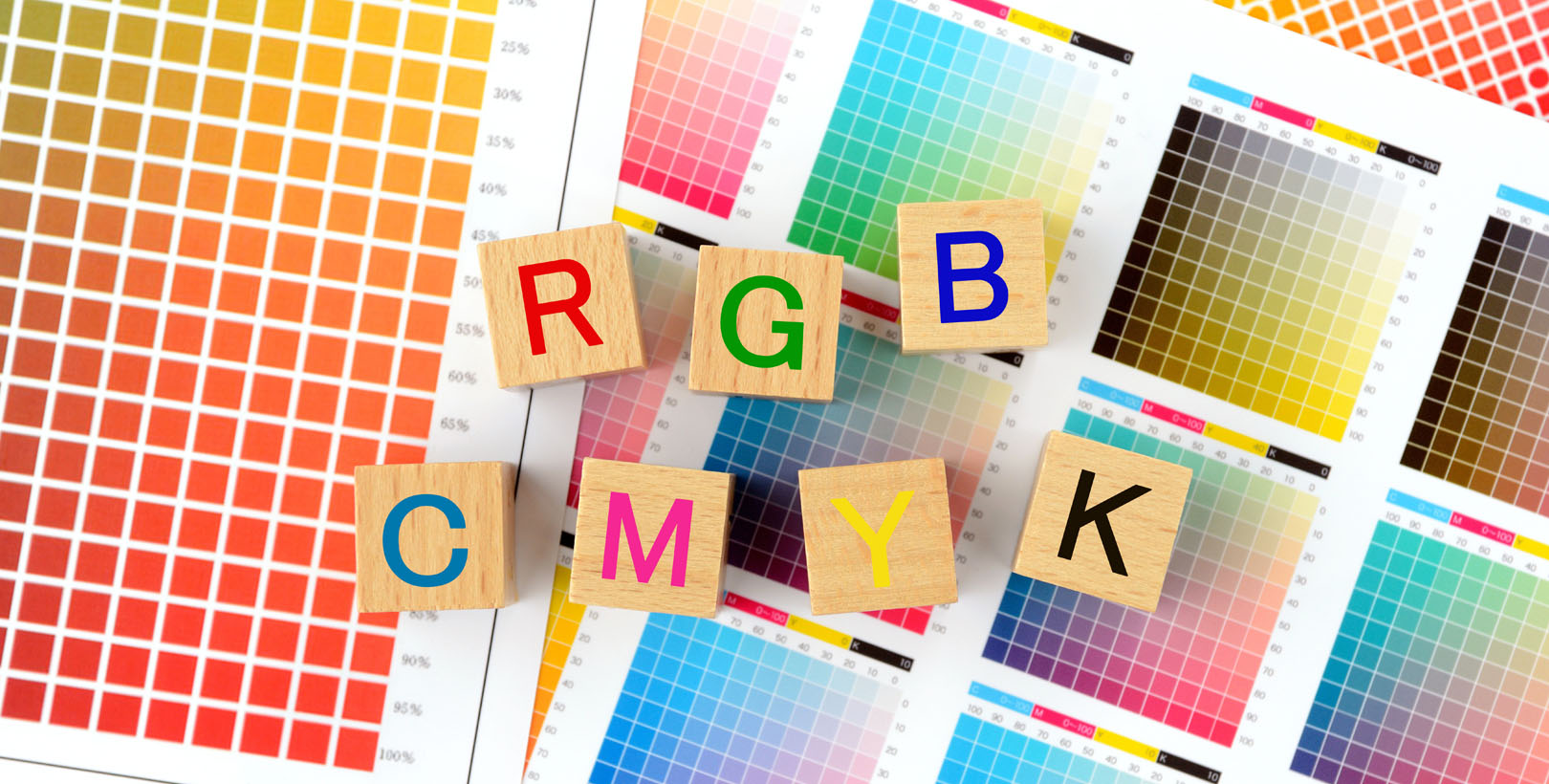
In the RGB corner, we have the dynamic trio of red, green, and blue. These primary colours come together to create that mesmerising white light we see on our screens. But in the CMYK ring, the primary players are cyan, magenta, and yellow. When these pigments mix, they produce a more muted, earthy black.
When it comes to colour possibilities, RGB has the upper hand, boasting a staggering 16.7 million colours. CMYK, while still impressive, tops out at a mere 16,000 shades. Surprisingly, RGB files tend to be smaller in size compared to their CMYK counterparts. in summary, RGB is the digital dynamo, while CMYK reigns supreme in the world of print. Understanding the strengths and limitations of each colour mode is crucial for designers and creatives to ensure their projects pop, whether on a screen or on the page.
RGB Meaning
RGB colour mode is like the magician of the digital world, using red, green, and blue as its primary colours to create a dazzling spectrum of hues. Unlike traditional paints or pigments, RGB works with light to define colour, making it the go-to choice for anything digital—think smartphones, computer screens, and TVs.
Here’s the cool part: digital displays use tiny red, green, and blue light bulbs that shine at varying intensities to mix and create the colours you see on your screen. It’s like a symphony of light, with each bulb playing its part to produce vibrant visuals. This clever system is designed to mimic how our eyes work—specifically, the cones in our retinas that are sensitive to red, green, and blue wavelengths. So, in a way, RGB isn’t just about technology; it’s about speaking the same "language" as our eyes. Pretty neat, right?

Some Examples of When to use RGB:
- Online infographics
- Social media images
- Profile photos
- Web or app logos
- Online buttons or graphics
- Digital icons
- Video production
CMYK Meaning
What is CMYK, you ask? Well, it’s the mastermind behind printed colours, standing for cyan, magenta, yellow, and black (aka Key). Unlike RGB, which works with light, CMYK uses pigment in a subtractive mixing process to create colours. Think of it as layering paint—each pigment absorbs (or subtracts) certain wavelengths of light, leaving behind the colours you see. Want to try it out? Grab some food colouring! Mix red and yellow, and voilà—you’ve got orange. Science and art, right in your kitchen.
Now, here’s where things get interesting. Printers don’t just rely on cyan, magenta, and yellow alone. Why? Because these pigments are a bit too transparent to create a rich, deep black. Even if you layered all three together, you’d end up with a muddy, dark grey—not the bold black you need for crisp text or sharp details. That’s why black ink gets its own cartridge, often called "K" for "key." It’s the secret weapon that gives printed designs their depth and definition. So, next time you see a beautifully printed page, you’ll know CMYK is the unsung hero behind the scenes. Think brilliantly bold stickers that stand the test of time, eye-catching event flyers, and on-brand menus for your establishment, all requiring the power of CMYK!
Print It Black
Unlike the single shade of black that you get in home printers, professional printers, such as yours truly, can print different “shades” of black. This is not only great from a design point of view, but it also reduces the potential oversaturation of black ink. If you’ve ever used cheap paper in your printer, you will have noticed that the copy can come out wet and fragile… Nobody wants that.
We only use the best available papers and inks and thus we can get some incredible colours. But here’s a basic show of the most popular shades of black, and their corresponding colour code.
The Case for Conversion and Potential Issues
We’ve all done it at some point, started a project in RGB and needed to convert it to CMYK for print. Not to worry! There are ways and means to get you out of this pickle. But do be aware that changing the colour profile from RGB to CMYK can result in some colours changing slightly. This is purely because we’re changing from a gamut of 16.7 million colours down to 16 thousand. The software will get your colours to their closest CMYK counterparts, but you might have to make some manual adjustments. Here are some quick instructions on how to change colour profiles in the Adobe software suite.
Photoshop
- Navigate to [Edit]
- Click “Convert to Profile”
- Select your desired colour mode in the destination space
InDesign
- Navigate to [File]
- Click “Adobe PDF Presets”
- Click on [Press Quality]
- Save the file
- In the pop-up box, select Output on the left-hand side
- Select your desired colour mode in the destination space
Illustrator
- Navigate to [Edit]
- Click “Edit Colours”
- Select your desired colour space

What File Types are Best for RGB and CMYK?
Whether you’re crafting something for the digital world or prepping for print, picking the right file type is like choosing the perfect tool for the job. It’s not just about saving your work—it’s about ensuring your design keeps the best clarity so that we can print the finest products around.
Best File Types for RGB


- JPEG: JPEGs are a great choice for digital files since they are a median between size and quality and have a good range of compressibility.
- SVG: SVG files assign code to each shape in your design that can be read by a browser or app. They can be dynamically resized to fit any screen whilst maintaining the finest quality.
- PNG: PNGs are small-size file types that allow for transparency. The best format to use if you require the background or area of an image to be transparent.
- GIF: GIFs are relatively small files that can display animated images in a browser or app. Any small moving images will be best in this format.
Best File Types for CMYK


- PDF: PDFs are ideal for print projects as they are compatible with most formats. They can be used to save bitmaps, vectors, and combination files.
- AI: AI (Illustrator) is a vector design program, able to create images that can be resized with no loss of quality. Perfect for large designs meant for posters or screen prints.
- EPS: EPS is a vector file type that’s compatible with pretty much all vector programs.
- TIFF: TIFF (TIF) images are preferred for high-resolution photos and are often used by photographers who may want to print large copies of their images.
We Need to Talk About Pantone
Pantone colours are the secret sauce behind the vibrant and consistent visuals we see in everything from fashion to packaging design. At the heart of it all lies the Pantone Matching System (PMS), a universal language of colour that ensures everyone—from designers to manufacturers—speaks the same "colour code." Imagine trying to describe a specific shade of blue without a system like this. Is it sky blue? Navy? Somewhere in between? Pantone eliminates the guesswork by giving each colour its own unique code, making communication crystal clear.
What makes Pantone so special is its use of spot colours—inks created from precise formulas rather than mixing the standard CMYK (Cyan, Magenta, Yellow, Black) printing process. This means Pantone colours can achieve shades and tones that regular printing just can’t replicate. Need a vibrant orange that pops just right on a product label? Or a rich, deep green for your brand logo? Pantone has got you covered. It’s all about precision, consistency, and making sure your colours look the same no matter where or how they’re printed.
Beyond its technical brilliance, Pantone has become a cultural icon. Every year, the Pantone Colour of the Year makes waves in fashion, interior design, and beyond. It’s more than just a colour—it’s a reflection of global trends, moods, and cultural shifts. When Pantone announces the colour, it sets the tone (literally) for design trends across the world. Think of it as the colour equivalent of a trend report.
In short, CMYK and Pantone colours are a bridge between creativity and production. Whether you're designing a logo, picking out a paint colour, or creating a fashion collection, Pantone ensures your vision comes to life with precision - the gold standard in colour communication.
Which is better for print—RGB or CMYK?
The truth is that both are equally important and serve different purposes. Graphic designers often create stunning RGB images for digital platforms, like logos or online campaigns, while pairing them with equally impressive CMYK designs for printed materials like brochures or merchandise. It’s a dynamic duo that ensures your brand looks amazing both on-screen and in print.
But it’s not just for businesses—everyday people use RGB and CMYK printing for all kinds of projects, from custom-made wedding invitations to personalised gift boxes. The key is finding a service that offers both graphic design and printing expertise. Here’s why it works: most of us are visual creatures, drawn to the vibrant colours and light of RGB on our screens. Once that image is etched in our minds, we easily recognise it in its CMYK form on printed materials. While you could stick to just one, combining both ensures your designs stand out everywhere—online and off.

 USA
USA FR
FR
