USA
USA FR
FR


What is spot colour?
You may have heard the term spot colour before when preparing your artwork for print. This print process is a favourite amongst designers and businesses alike for good reason.
But what is spot colour in printing? And how do you know whether printing this way is the best choice for your designs?
What is Spot Colour in Printing?
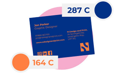
Spot colours are created using premixed inks, designed to produce a specific and controlled colour. These colours can range from vibrant neon to pastels to deep hues, with the premixed inks allowing spot colour to produce an incredible range of shades.
Each colour is identified using a universal reference number, the most well known of which being the Pantone Matching System - more on that below. These reference names can be used by any printer to produce a near identical replica of the colour each time.
Being made from a premixed ink requires spot colour to be printed using litho printing. Within litho printing the spot colour is applied to a bespoke plate in the shape of your design. Once the plate is applied to paper, this colour is transferred, reproducing the design flawlessly.
How does Spot Colour Printing Work?
Using the spot colour reference code, the spot colour is identified
A bespoke printing plate is created to match the spot colour design
The spot colour ink is applied to the plate which is then applied to the paper
What is Pantone spot colour?
Arguably the most well-known spot colour example is Pantone. Each colour within the Pantone library has a unique name and code, used by litho printers to reproduce the exact tone in print.
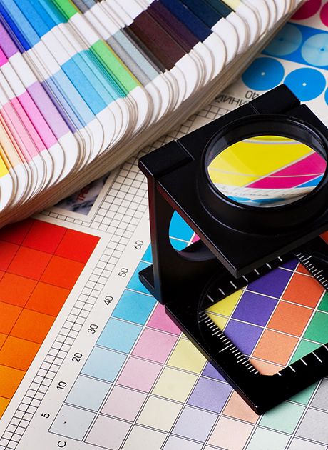
Pantone has developed its Pantone Matching System, a booklet that not only provides examples of Pantone across coated and uncoated papers, but also with process colours like CMYK. This provides a universal colour matching system that can be used within multiple printing companies, across different materials, and in unique processes.
When talking about spot colour screen printing, Pantone is at the forefront of the conversation. This collection of colours is beloved in business branding, with many companies choosing to have a Pantone colour associated with their brand identity.
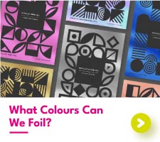
What are the different types of spot colours?
Spot colours come in many forms. Alongside the traditional solid colours, spot colours can also include bright neons, metallic inks, white, and spot uv colour which is a transparent gloss.
Spot Colour Variations
Spot colours aren't just the typical printed colour. Neon metallic inks and gloss iv are all examples of spot colour varaitions

Neon

Metallic Ink

White

Spot UV Gloss
Each of the above colours requires a special printing press, for these colours are much more difficult to produce. Within litho printing, more plates are needed for each unique spot colour and in digital printing, a fifth colour slot must be present within the machine for the colour to sit.
What are spot colours used for?
Although spot colours can be used for any type of print, this process is primarily used for brands wishing to recreate specific colours within their print materials. Having a certain colour linked to a brand makes that brand more recognisable, memorable, and cohesive.
Here are some common spot colour examples:

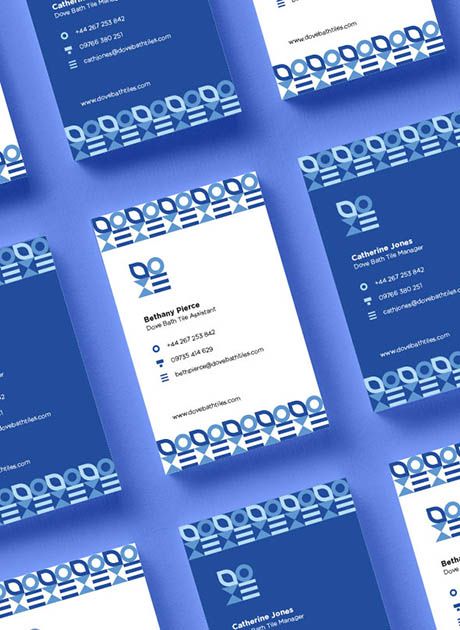
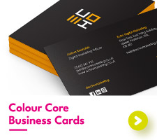
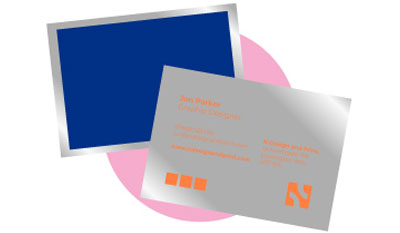
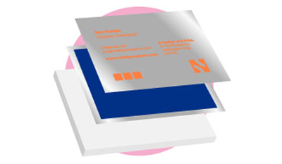
Business cards

Letterheads

Compliment Slips
What is the difference between spot colour vs process colour?
So, we know what a spot colour is, but how does it differ from process colour printing?
Where spot colours are formed using premixed inks, process colours are not premade. Instead, process colours are made within the printing press, using a combination of four set colours.
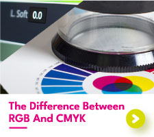
CMYK is the most common form of process printing. In this technique, the four colours Cyan, Magenta, Yellow, and black (Key) join to make the final printed colours. Each colour is applied to the paper separately in varying amounts. After each colour is applied, they merge to create the end piece.
CMYK Printing
The Four colours within CMYK are applied on top of each other to create the final artwork

The main difference between process colour vs spot colour is the control. With spot colour printing, there is much more control over the appearance each colour produces. Spot colour manufacturers, like Pantone, are very strict in how their colours are produced, keeping standards and consistency high.
Process colours on the other hand are made inside the printer and as such aren’t as controlled. This often results in discrepancies in the printed colour. Different papers and printers can print the same colour file and produce a range of shades.
When choosing to print process colours digitally, your printer may recommend a colour match to reduce the effects of these varying shades.
How to make a spot colour in Illustrator?
Your printer will need your artwork files to be set up as a spot colour if you choose to print this way, whether you're after circular business cards with spot UV or something else entirely.
To make a spot colour in Illustrator, you will first need to find the Pantone colour reference you want to use. Then, convert your design on screen into this colour.
Currently, the colour on screen is a process colour, meaning it is designed to be printed as CMYK. We don’t want this so head to the swatches panel by going to Window > Swatches. Add your current colour to the swatch panel by selecting the plus symbol in the square.
This opens up the details about that colour, giving you the option to change the colour from process to spot.

Before closing this window, don’t forget to name your new spot colour after the colour reference name. Without this name, your printer won’t know which colour you want to print.
All that’s left is to save your Illustrator file out as a PDF using File > Save As, and you’re all set.
Printing Spot Colour With Aura Print
At Aura Print, we have both traditional and modern metallic silver and gold spot colours for you to choose from. Want to print a specific Pantone colour? Then check out our spot colour business cards, letterhead, and compliment slips to splash your spot colours across your business materials.
For more on spot colour printing, get in touch with our team to discover your print options.