Flyer Marketing 101: Benefits and Design Secrets
Reasons You Should be Using Flyers
There are many different ways for you to advertise your event, goods or services. Here’s why flyers are a perfect marketing tool for businesses of all sizes.


A Cost-Effective, Affordable Solution
Studies show that leaflet printing or flyer printing is more cost-effective than other channels of promotion such as email or TV. According to the Data and Marketing Association, the under 35 age group now interact with more door drops than any other age group.


Quick to Produce
Even if you have short notice about an upcoming event, flyers can be produced very quickly. At Aura Print, we are able to print and dispatch your flyers as quickly as 1 working day after proof approval.


Immediate and Long Term Impact
As soon as your flyer is received, people have the crucial information about your event, allowing for planning and making them more likely to attend. An added bonus with flyers is longevity - customers often hang on to them until they need your product or service.


Easy to Measure Success
Simple measures allow you to easily measure the success of your flyer campaign. You can do this using a specific call to action, QR codes, unique numbers or discount codes. The more targeted your campaign is, the higher your response rate will be.


Easy to Distribute
You can hand out flyers yourself or leave them in high-traffic areas. Or you can hire somebody to distribute them for you if you have a mass marketing campaign or for very specific targeted mailshots.


Extended Part of Your Brand
Flyers can be used together with digital marketing campaigns to help reinforce your brand, to direct customers to further information from your website and to complement digital campaigns with a physical entity for customers who prefer that. Ensuring your campaign has all the bases covered.
Good Flyer Design Tips
You know how effective flyers are for your marketing. It would be a shame for poor content or design to spoil the effectiveness of your campaign. We have identified the key elements to help you avoid this.


Keep the Flyer Design Simple
Keep the design simple to avoid missing out on potential customers by overwhelming them with too much information. According to statistics you have roughly 2 seconds to make a good first impression and capture the reader’s interest.
*Keep colours to a minimum. Too many colours will make your leaflet stand out for all the wrong reasons.
*Use images wisely. Don’t use too many graphics and make sure they are relevant.
*Don’t use lots of different, fancy fonts. Stick to one or two font styles that are clean and legible.


Make it Easy to Read
Sounds simple, doesn’t it? Yet too many people try and cram in way too much information when creating flyers.
*Start with a clear, headline that is to the point.
*Like your headline, keep your message as short and to the point as possible. Too much information will either make your flyer overwhelming or difficult to understand.


Know Your Audience
The content of your flyer should always be relevant to your target market. Ensure the design and content is relevant to that target market to maximise the impact of your campaign.
Unless you only offer one product or service, don’t try and produce one flyer that covers absolutely everything you do. If you offer lots of different services, you will achieve better results by splitting that content into separate campaigns.


Create a Good First Impression
This may be the first contact you have with a potential customer so take the opportunity to WOW them. Cheap flyers portray a cheap approach where luxurious flyers suggest you are a brand that is serious about quality.
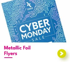
Aura Print offer plenty of luxury options such as specialist papers and high-end embellishment options like metallic foil and raised spot UV.


Measure your Campaign's Success
The more you measure your marketing, the more successful it will become as you will see what is working for you and continually refine your campaigns. Here are a few ideas for easy ways to measure success:
*QR Codes
*Unique numbering
*Discount codes


Link Back to Your Business with a Call-to-Action
Research suggests that people like to be prompted what to do next, so spell out what you want them to do – drop you an email, give you a call or check out your website.
Provide clear contact details, whether that be your address, telephone number, email or socials – make it easy for them to get in touch.
So, What Are You Waiting For?
The benefits of printed flyers and leaflets can be endless and help push your business or event to the next level, especially if the design and content are well thought out.
At Aura Print, we can print your flyers from artwork you have created, or our talented team of designers can create a bespoke design specifically for you. We have the expertise, tools and materials to help you reach your target audience and achieve your business goals. So, if you want to give your marketing a boost, get your flyer campaigns moving with Aura Print.

 USA
USA FR
FR
