USA
USA FR
FR


When it comes to creating a memorable business card, every detail matters, and the colour of the foil you choose can make a significant impact. Foil printing adds a touch of elegance and sophistication, making your card stand out from the crowd. But with so many foil colours available, how do you choose the right one for your business card? This guide will help you navigate the options and select the perfect foil colour to reflect your brand’s personality and make a lasting impression.
The Significance of Colour in Branding
In the realm of branding, colours serve as a silent yet powerful language, weaving stories and crafting perceptions that resonate deeply with an audience. They possess the unique capability to evoke a spectrum of emotions, from trust and calmness to energy and excitement, thereby playing a crucial role in the psychological impact of a brand's visual identity. This psychological interplay between colour and perception is foundational in creating a brand identity that is not only visually appealing but also emotionally engaging.
When it comes to the application of foil colours on business cards, this principle is no less significant. The choice of foil colour is not merely an aesthetic decision; it is a strategic branding tool that communicates your company's values and ethos without the need for words. A well-chosen foil colour can reinforce your brand's identity, accentuating its core values through visual cues that are intuitively understood by the viewer. This implicit communication is critical in today's saturated markets, where the ability to stand out and instantly convey your brand's essence can make the difference between being remembered and being overlooked. By carefully selecting a foil colour that aligns with your brand's messaging, you create a tangible extension of your brand's identity, one that customers can physically hold and remember.
In essence, the impact of colour in branding extends far beyond mere decoration; it is a fundamental aspect of brand strategy that enhances recognition, fosters emotional connections, and ultimately, drives brand loyalty.
Decoding the Messages Behind Foil Colours

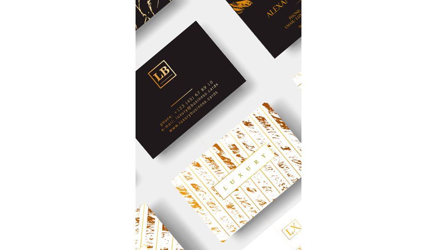
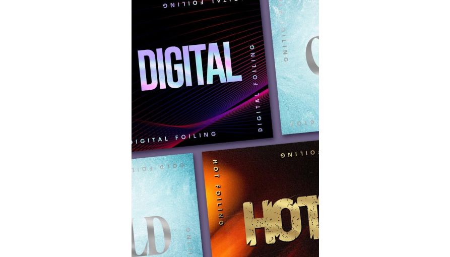
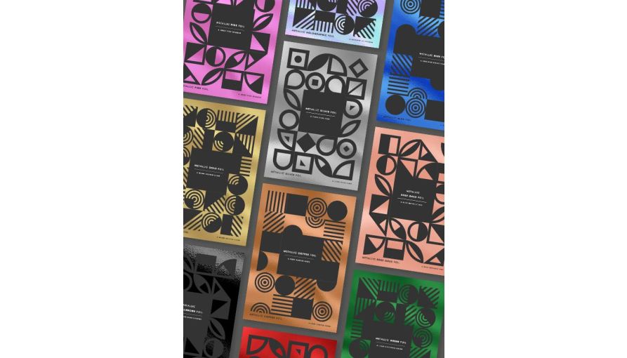
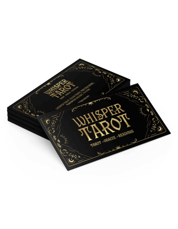
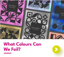
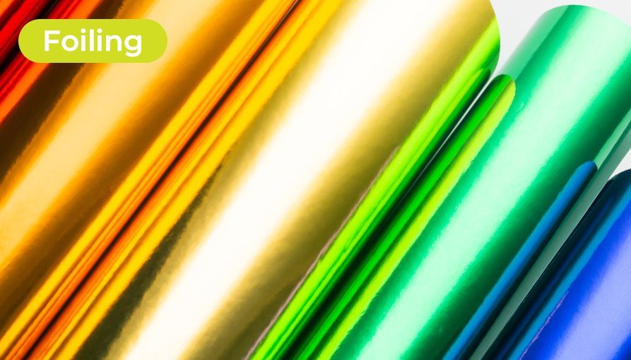
Exploring the myriad of foil colours offers a unique insight into the language of branding through hues. Gold foil, with its timeless allure, is synonymous with luxury, evoking feelings of opulence and high status. It is particularly suited for brands that wish to associate themselves with exclusivity and premium offerings. Silver, on the other hand, projects a sleek and futuristic image, perfect for businesses aiming to communicate cutting-edge technology or chic elegance.
The warmth of Rose Gold foil can imbue a business card with a sense of modern femininity and approachable luxury, making it a popular choice among brands that cater to a stylish, contemporary audience. Copper foil is less conventional, radiating creativity and a certain artisanal charm, ideal for businesses that pride themselves on uniqueness and innovation.
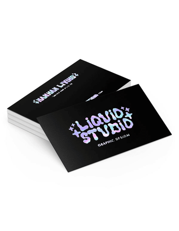
Holographic foil stands in a league of its own, capturing the essence of dynamism and creativity. Its shifting colours and playful light reflections make it an excellent choice for businesses that want to convey a sense of excitement and forward-thinking. Matte foil, with its understated elegance, offers a sophisticated option for brands that prefer subtlety over shine, emphasising a modern, refined aesthetic.
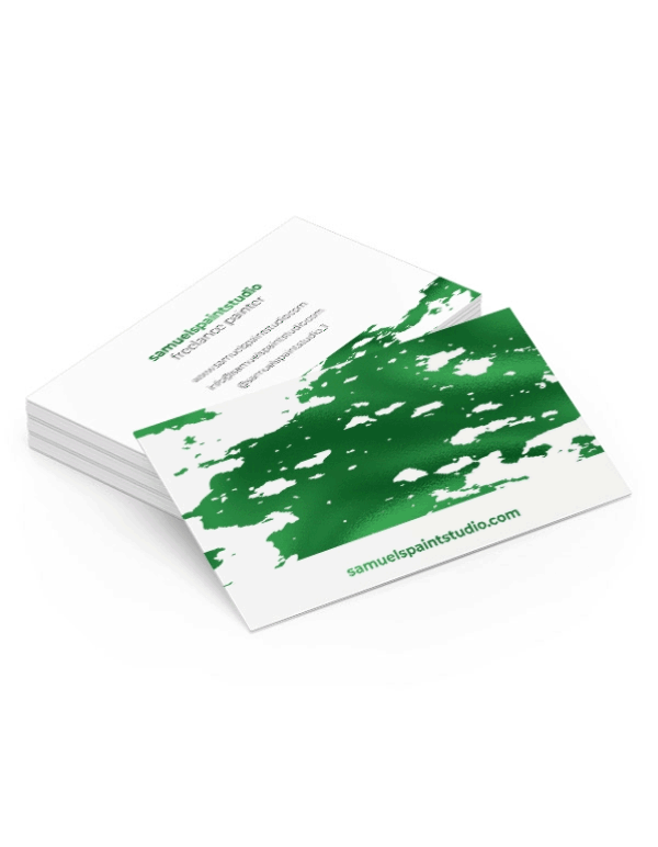
Coloured foils, ranging from vibrant reds to deep blues and greens, provide a versatile palette for brands to align closely with their visual identity. These bold choices can infuse a business card with personality and make a statement about a brand’s character and vision.
Through the strategic use of foil colours, businesses can craft a visual narrative that not only enhances their brand's visual appeal but also deepens the emotional resonance with their audience, leveraging colour psychology to communicate their unique story and values.
Matching Foil Colour with Your Brand Identity
Selecting the appropriate foil colour for your business card demands a deep understanding of your brand’s core values and personality. It's essential that the choice of colour reflects the essence and aspirations of your business, harmonising with your brand's visual narrative. For instance, businesses that exude luxury and sophistication may find that gold or silver foils underscore their market positioning, signalling reliability and esteem to their clientele. Conversely, brands that are youthful and vibrant, aiming to present themselves as fresh and innovative, might lean towards the playful dynamism of holographic foil or the bespoke charm of copper, which suggests creativity and distinctiveness.
Consideration of your industry is also paramount. Traditional sectors, such as banking or legal services, might gravitate towards more conservative foil colours that evoke stability and professionalism. On the other hand, the creative sector — encompassing anything from marketing agencies to art studios — offers the freedom to experiment with a broader spectrum of foil colours, potentially incorporating bold and unconventional hues that align with the brand’s creative output and ethos.
Moreover, the psychological implications of colour choices cannot be overlooked. Each colour communicates subtle cues and can significantly influence perceptions of your brand. Aligning the foil colour with your brand identity involves not just aesthetic appeal but also leveraging these psychological effects to forge a deeper connection with your target audience. The goal is to choose a foil colour that not only complements your brand's visual identity but also resonates on an emotional level with your intended audience, reinforcing the desired perception of your brand through every detail of your business card design.
The Importance of Colour Scheme Compatibility

The harmony between the foil colour and the card's overall colour palette is crucial for achieving a design that is both visually striking and cohesive. This interplay of colours must be carefully managed to ensure that the foil does not overpower or detract from the overall design aesthetic. A well-considered colour scheme enables the foil to serve as a focal point, drawing the eye to key information or branding elements without overwhelming the senses.
Contrast plays a pivotal role in this balance, creating a visual hierarchy that guides the viewer's attention effortlessly across the card. For example, a deep, rich background can be beautifully complemented by the luminosity of gold or silver foil, lending an air of sophistication and prominence to the text or logo. Conversely, a lighter backdrop might benefit from the subtle elegance of matte or coloured foils, which can provide a refined contrast without competing with the card's base colour.
It's also worth noting the emotional and psychological impact of colour combinations. The right pairing can evoke the desired response from your target audience, reinforcing your brand message through visual cues. For instance, a vibrant red foil on a stark black background can convey passion and energy, ideal for brands looking to make a bold statement.
Ultimately, the key to colour scheme compatibility lies in understanding the interplay between background and foil colours, ensuring they complement rather than conflict with each other. This careful curation not only enhances the aesthetic appeal of your business card but also strengthens the communication of your brand's identity through strategic colour use.
Considering Your Target Audience
When tailoring the aesthetic elements of your business card, the demographic and psychographic characteristics of your target audience play a pivotal role. The preferences, values, and lifestyles of those you aim to attract should influence your selection of foil colour. For instance, a clientele with a penchant for tradition and sophistication might be more inclined towards the refined appeal of gold or silver foils, which symbolise enduring value and reliability. Conversely, a brand that resonates with a youthful, dynamic audience may find the iridescent allure of holographic foil more appropriate, as it embodies innovation and a forward-thinking ethos.
Equally important is the consideration of cultural perceptions of colour, which can vary significantly across different groups. What appeals to one demographic might not hold the same charm for another, making it crucial to understand the cultural and emotional connotations of colour choices. For brands aiming to establish a connection with creative professionals, exploring unconventional foil options like matte or coloured foils could be beneficial, reflecting a sense of creativity and boldness.
Moreover, the evolving trends within your audience’s preferences should not be overlooked. Staying attuned to these shifts can offer opportunities to refresh your branding with foil colours that capture the zeitgeist, further cementing your relevance and appeal among your target market.
The Role of the Business Card's Purpose
The context in which your business card is shared plays a pivotal role in selecting the appropriate foil colour. For environments that are more traditional or corporate in nature, opting for classic hues such as gold or silver can convey a sense of professionalism and timelessness. These colours are universally recognised symbols of reliability and sophistication, making them ideal for formal networking events or meetings with high-value clients. On the flip side, creative industries or casual gatherings provide an opportunity to experiment with more unconventional foil colours. Holographic, copper, or even brightly coloured foils can project a brand’s innovative spirit and originality, engaging a demographic that appreciates uniqueness and creativity. Such choices can serve as conversation starters, offering a memorable point of distinction in informal settings.

It's also essential to consider the specific objectives behind distributing your business cards. If the aim is to highlight a cutting-edge product or service,
Tips for Integrating Foil Effectively into Your Design
Incorporating foil into your business card design requires a keen eye for detail and an understanding of balance. One of the most effective strategies is to utilise foil highlights to draw attention to the primary elements of your card, such as the company name, logo, or crucial contact information. This method ensures these key details catch the eye first and remain memorable.
Simplicity cannot be overstated when applying foil accents. A minimalist approach, where foil is used sparingly, often results in a more refined and impactful design. It's about finding the right equilibrium where the foil accents enhance rather than overpower the overall aesthetic of the card.
The design process should be iterative, allowing for the exploration of various foil colour options. Creating prototypes or mock-ups is invaluable, as it provides a tangible representation of how different foils interact with other design elements on your card. This step is crucial for visualising the final product and making informed decisions about which foil colour best aligns with your brand's identity and the card's design.
Engaging with your target audience or seeking feedback from peers can offer fresh perspectives on your foil choices. Understanding how others perceive the combination of colours and textures can guide you towards a design that not only resonates with your brand but also appeals to the aesthetic preferences of your clientele.
Experimenting and Finalising Your Design

Selecting the ideal foil colour is a critical step towards reinforcing your brand's visual narrative. To ensure the chosen hue complements your brand effectively, undertake a phase of experimentation. Develop several prototypes, each showcasing a different foil colour in conjunction with your card’s design elements. This comparative analysis allows you to visually assess which option best conveys your brand's ethos and resonates with your intended demographic.
It's beneficial to solicit feedback during this phase, gathering insights from a diverse range of perspectives within your target audience or from industry peers. Their reactions can illuminate preferences you might not have considered and help refine your choice to ensure it appeals broadly yet distinctly.
Once you've navigated through these stages, refining your design based on feedback and your brand’s core identity, the final selection should emerge naturally. This meticulous approach guarantees that your business card not only captures attention but also embodies your brand's essence, making a compelling and memorable statement. You can order a sample pack of our foil colour range here.