Mastering Leaflet Marketing: The Do's and Don'ts of Leaflet Promotion
Promotion Leaflet Printing
Using premium printed leaflets to promote your company, service or event has proven to be a highly effective marketing method over the years. Provided you get the process right from start to finish, leaflets can maximize your results and help to push your business forward.
Get it wrong though, and the money you spend on your leaflet campaign could be all but wasted – so it’s well worth getting it right by reading our handy guide before you begin.
How many leaflets should I get?

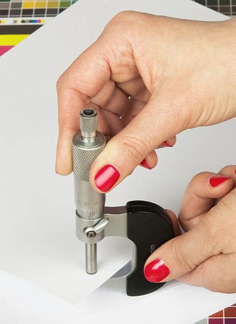
Some people may order around 250 leaflets, (a relatively small amount for a campaign), thinking that this will have a large-scale effect. This is a stack of prints about an inch tall – which might sound a lot, but it's really not!
When you hand out or mail a leaflet, you ideally want that person to react positively, choosing to enquire further and spend money with your business. But, as with every other marketing campaign in history, it really comes down to the funnel principle – meaning that for all the hundreds or thousands of people you advertise to, a minimal number will reach the point of doing business with you. From the biggest brands to the smallest sole traders, this is just how it goes with those pesky conversion rates!
Research shows that the percentage of your target audience who will do business with you is around 1%. (So for every 100 leaflets you hand out, you may pick up one customer.) So with an order of 250 leaflets, for example, you may get a few customers at most. Depending on your line of work, the profit on these 3 transactions may not even pay for the leaflets themselves – so you may need to look at larger amounts to ensure your leaflet or flyer campaign is successful.
Printing is much cheaper in larger numbers, so buying 10,000 copies will mean that each leaflet carries a significantly smaller cost. It also means you can expect to pick up more customers through a wider reach when you've distributed them all.
Leaflet distribution methods

There are several ways to distribute leaflets and choosing between these methods depends on how many leaflets you want to circulate, how quickly, and over what area you need to do it.
The first method is the small-scale, passive marketing approach of distributing leaflets yourself and letting people pick them up as and when they're interested. Putting a stack of leaflets in shops is good if you're able as this allows you to shift a lot of leaflets with no effort – though it might take a little while.
The second method involves outsourcing your efforts. Eventually, with large quantities, you'll need to think about using a professional leaflet distribution service. These companies will deliver your prints door to door for you in a specific postcode area (or areas) – and if your time is better spent elsewhere then it makes sense to invest in these services rather than doing the laborious work yourself!
Speaking of which, if you can get family and friends to help you, you could probably post your leaflets to several thousand homes in the space of a couple of weeks. It takes time, but to get the maximum reach you really need to pound the pavements and get plenty of leaflets out there.
5 pro tips for an effective leaflet design

Distribution is half the battle, but before that, it’s well worth getting your leaflet design right. A clean, impactful, and effective leaflet design relies on a few essential principles, but applying these tips could put your own leaflets way ahead of your competition! Let’s take a look…
1) Short & catchy headline
Think about the world’s biggest brands. Their marketing doesn’t divulge everything all at once; instead, it has the confidence to deliver one short, catchy message. Keep your leaflet headline or title to five words or less, and focus on the main benefit of your product or service. This is the first part of your leaflet that people read, and may be the only chance you have to grab their attention – so short and sweet is always best.
2) Show your USPs
What sets you apart from your competition? What makes your brand different? How are you better at solving someone's problem, and what extra benefits do you offer? Choose five key points that set you apart and have a nice, clear, bullet-pointed list featured prominently on your leaflet.
3) Sell the benefit, not the product
It's easy to list what you do or sell, but try to avoid this. Your prospective customer is much more interested in the benefits to them, so try to look at your leaflet’s design from their point of view. Show them the problem you’re promising to solve, whether they need an oil change or a new place to eat. Tell them how your product or service will benefit them, or give them a great experience.
4) One good image is better than ten poor ones
A picture speaks a thousand words, but that’s not to say that more pictures are better than one. One big picture with lots of visual impact is worth a lot more than several smaller images. Crucially, you need to bear in mind that people might take just a single second to glance at your leaflet, so you really need to catch their eye with a compelling full-size image. Spend some time choosing one picture that you really love, and keep it at that.
5) Don't squash too much onto your leaflet
Overall you want to keep your leaflet clean, avoiding swamping your reader with too much irrelevant information. A leaflet needs more information than a business card, but less than a brochure. A design that uses clear space, or plenty of its background image(think of this as 'visual breathing room’), is much more likely to be read. This will look more attractive than a design with tons of clutter squashed in there. Finally, encourage the potential customer to contact you!.
5 mistakes to avoid
1) Your logo's too big
So you've started a new business, and got a new logo designed. The biggest mistake you can make at this point is to feature your logo too strongly on your leaflet design. The reason for this is that nobody will really know who you are yet, so your logo alone doesn't mean much to anybody! Having it shown large-scale on your leaflet will just take up valuable space. Keep your logo small for now, and use the space you’ll save for a more attention-grabbing headline.
2) Listing services
Listing your services on your leaflet would seem like common sense, but will this grab your reader's attention? People only really pay attention to wording that speaks to us on an emotional level about things that we either want or need. It’s well worth taking a little more time to move past the features or services you offer into the realm of actual benefits for your customer. For example: no one buys a new vacuum cleaner for its cyclone technology. They buy it because its stronger suction makes cleaning faster, with no bag to empty when they’re done. Therefore, “this new vacuum will make your life easier”. That’s the real benefit behind the sell.
3) Not personalizing your business with your audience in mind
If you have a targeted audience in mind, then you need to tailor the design of your leaflet to appeal to them. Be sure to tailor your leaflet's design and tone of voice, using language that your buying audience will appreciate and understand.
4) Closing passively
It's typical at the bottom of a leaflet to have your contact details. (This effectively leaves it up to the customer as to whether they want to get in touch, with no real encouragement from you.) But instead of just having your website, social media handles, and phone number there, have these contact details alongside an incentive; perhaps a discount code or special deal that will encourage people to get in touch.
5) Printing one side only
It doesn't cost twice as much to have your leaflets printed on both sides, so using all the space available to you is something you should think about. You can have the back of your leaflet designed to inform rather than grab attention seeing as the front should be doing this for you. This will almost give your leaflet the functionality of a brochure – where the front side is the attention-grabbing cover, and the reverse features the content that’ll persuade people to do business with you. You'll pay a little more for design, (unless you’re designing it yourself), but this won't double the amount you'd pay for printing on just one side.
Using leaflets effectively
With folded printed leaflets, the overall idea is to tailor their design, quantity, and distribution method to the market you are trying to appeal to. Design your leaflet wrong, and you've wasted your time. Don't print enough, and you won't pick up enough work because return percentages are always much, much lower than anybody thinks. Lastly, spending too much time distributing your leaflets means that you'll be neglecting your business. If you're nurturing a new company that's just getting off the ground, leafleting should just be another marketing method designed to drum up new business – not distracting you and taking your eye off the ball!
If you'd like any more advice on promoting with leaflets effectively, or even if you'd just like to discuss what we can do for you, our expert team are always happy to help. Feel free to get in touch – we'd love to help you create create your promotional leaflets!

 UK
UK FR
FR
