UK
UK FR
FR


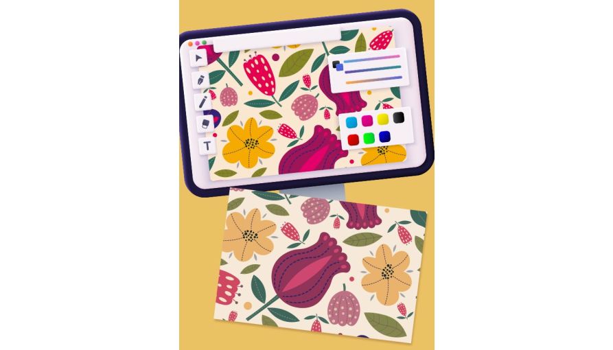
How To Set Up Photos For Print
Imagine it, you’ve designed a professional brochure for your company, full of beautiful photographs, and are wanting to get it printed. You’re sure that these brochures are bound to be a big hit at your next exhibition or client meeting. But once you receive your print, the excitement soon fades. Why do all the photos look so much darker than your original designs?
Unfortunately, photos appearing darker on the print is quite a common experience. There will always be differences between print and screen, but there are steps that can be taken to prevent any nasty surprises with your printed photos.
So, let’s take a look at ways you can prepare your photos to ensure that you get the best printed results.
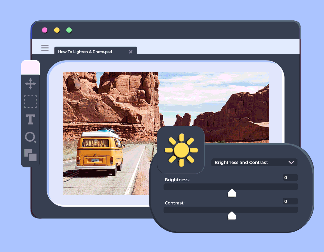
Lighten Up Your Photographs
The number one thing that you can do to prevent your photos from looking too dark is to lighten them. Simple adjustments to the brightness and contrast of your photos will make the world of difference when it comes to getting them printed.
Most design programs / photo editing softwares will have a built-in feature that allows you to manually adjust the light within a photo. Photoshop and Lightroom each provide a brightness and contrast adjustment that lets you change the brightness on a sliding bar scale.
There’s no need to go overboard when brightening up your images. The last thing you need is for your photos to become so oversaturated to the point when you cannot see what is pictured. Instead, make small adjustments to the brightness of your photo. The end result should have a clear difference in brightness from the original, but nothing too crazy.
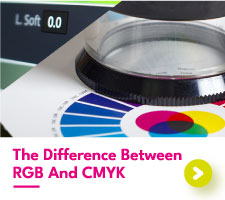
Convert Your Photos To CMYK
Digital cameras and phones display your photos as RGB and for good reason. RGB colors are brighter, more varied in the tones that can be produced, and are the most popular for digital use. If you want your photos to shine on-screen, then RGB is the way to go.
Printed colors are CMYK. Unlike RGB, the colors that can be produced using CMYK are not as vibrant and are slightly more limited in the different colour tones that can be created.
When printing your photos, you should keep in mind that they will appear in CMYK, not RGB. To see how your photos will appear as CMYK, simply adjust your artwork file to be in the CMYK color mode. This will automatically adjust the colors to only show those that can be printed CMYK.
Although screen colors always have the potential to look different to printed colors, setting up your photos in CMYK will give the closest on-screen representation of the colors that will appear on the print.
Ask For Advice
Our team have seen their fair share of disastrous photo prints. From incredibly dark backgrounds to red faced company portraits, we know what can happen when photos have not been adjusted for print.
Therefore, we know how to spot photos that are likely to print much darker compared to your phone screen. We want your printing journey with us to be smooth sailing, which is why you can always get in touch with any concerns that you may have with your designs. Feel free to send us over a quick email containing your artwork and ask our team for their recommendations.
Printing Photos With Aura Print
Printing photographs with Aura Print is a new experience for many of our customers. Whether you are wanting to print your family Christmas cards or postcards to send to your friends, chances are you’ve never had to adjust your photos for print before. We understand this, which is why we provide custom advice for every one of our orders, to help prevent any huge differences in color. If you’re ever unsure, we’re here to help.