UK
UK FR
FR
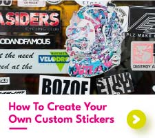

5 Top Tips For Designing A Successful Leaflet
So you're designing your own leaflet... It might be for a business, an event or something totally different, but in general there are some universal guidelines that will help your printed leaflet to do the job for you and your business.
Here are Aura Print's top five tips for a great, high-quality leaflet design, in no particular order...
#1 - Headline & CTA
Two things your leaflet design needs are a strong, attention-grabbing headline and a CTA (Call To Action). Your printed leaflet should feature a short and catchy headline or title. Keep it to five words and focus on the main benefit of your product or service for your target audience.
This is the first part that people read and it might be the only chance you get to grab their attention. Short and sweet is best. The same goes for your CTA. Research shows that people like to be prompted as to what to do next. Want them to check out your website? Give you a call? Shoot you an email? Spell it out that this is what you want them to do!
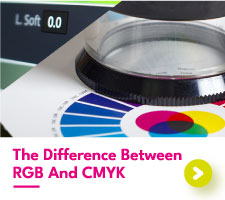
#2 - Colors

In an attempt to make their leaflet 'stand out' many amateur designers will use far too many colors in their design. This will indeed make your leaflet stand out, but for all the wrong reasons. If you're unsure, keep to black, white and one accent color like mid blue, orange or green and you won't go far wrong. Of course, if you have a company color scheme you'll want to incorporate this, but if your company scheme has more than three colors you'll either have to think again about your choices there or leave some out.
#3 - Readability

Almost all leaflet designs will contain text of some kind. The biggest mistake you can make is to have TOO MUCH text in your design. It can be really tempting to cram too much in.
This makes it confusing to look at, and also means that the text often has to be very small to fit it all on, especially with A5 and smaller sheet sizes. Keep the information short and to the point. Once you catch someone's attention they can always check out your website or give you a call for more details.
#4 - Images
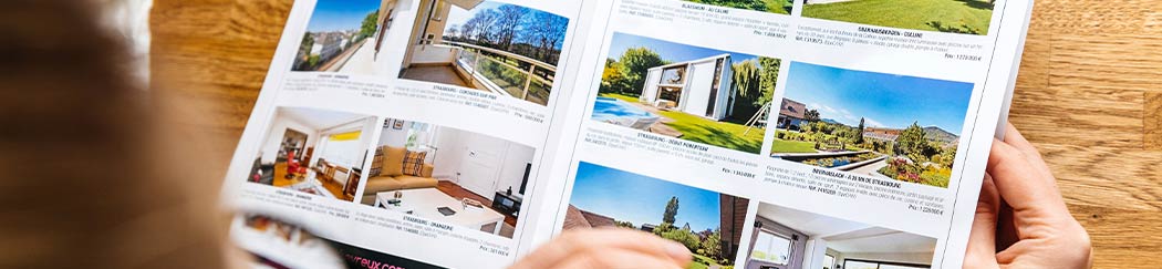
A leaflet (or folded leaflet) with just text can be pretty boring, so it's very common to use full-color pictures as part of your design. One great professional design tip is to use ONE large, high impact image instead of many smaller ones. While many small pictures may in theory show your products and services more effectively, it's often the case that one large image will get the potential client's interest in the first place. Hook them in with powerful imagery!
#5 - Logo
Most businesses these days have a logo, and of course, you'll want to put it on your custom leaflet. However, unless you're really well known you want to keep your logo quite small and keep most of the space for images and text. Think about it - if you're relatively unknown, your logo won't mean much to people at this stage and would just be a waste of space (especially important when you're paying for leaflet printing in larger amounts).
As your brand becomes more well known your logo can become bigger and bigger as people will more understand what you do and what your company stands for. Look at billboards for sporting events - the biggest companies in the world need ONLY display their logo - they're already household names. You, more than likely, are not quite there just yet.
The overall idea is to tailor the design to the market you are trying to hit and make the information attractive and easy to digest. Look at a leaflet as a simple introduction to a book rather than the story itself. Make a great impression when designing a leaflet, and the conversation can go from there.