USA
USA FR
FR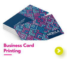


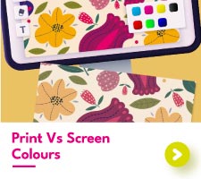
Print Vs Screen Colours
Colours that are seen on screen and colours that are seen in print don’t always match.
Understanding why these colour differences occur will help you to create print-ready designs and prevent disappointment when it comes to print.
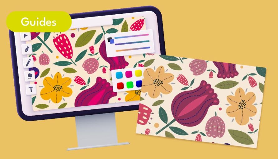
Why Do Colours Appear Differently On-Screen Compared To Print?
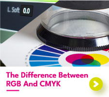
RGB vs CMYK
When it comes to colour there are two different types of colour spectrums commonly referred to in print. RGB and CMYK.
The colours you see on your screen are within the RGB spectrum. Colours in the RGB (red, green, and blue) mode can produce an incredible variety of bright colour tones that pop on screen. Designing using RGB is popular for digital creators simply due to the huge range of beautiful colour shades and blends that can be made.
CMYK colors, on the other hand, are used within print. The four colours – Cyan, Magenta, Yellow, and Black (key) – come together to produce a more limited range of colour tones compared to those of RGB.
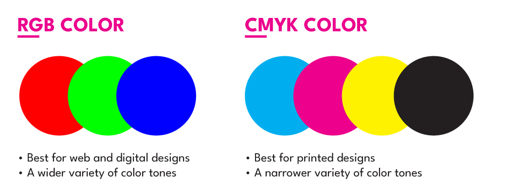
As RGB can produce a more varied selection of colours, when it comes to print, the exact shade won’t be able to be replicated. Instead, CMYK will produce the closest possible colour to the RGB which may result in your designs appearing muted compared to their on-screen counterpart.
We recommend to always create your print designs in the CMYK colour mode. This way, you can see what the colours you choose are going to look like once printed, avoiding disappointment with your prints.
Related:
What’s the difference between CMYK and RGB?
Pantone
Pantone is another set of colours that can be found in print. A Pantone colour is a custom colour mix that is used within litho printing as a fifth colour alongside CMYK. Using Pantone is popular in branding design, as Pantone colours will always print to the exact same colour tone, no matter the paper or printer.
We recommend avoiding Pantone when printing digitally. When setting up your print-ready artwork, make sure that any Pantone colours have been converted to process colours, as some printers are unable to recognize and print a Pantone spot colour.
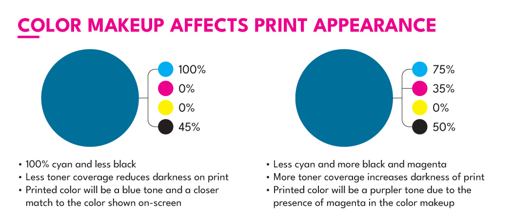
Colour Coverage
When designing in CMYK, it’s easy to pick colours based on their appearance instead of their colour makeup. There’s a difference between picking a blue that is made up of cyan only and a blue that is made up of all four colours of CMYK.
Colours with a heavy mix of each CMYK colour will often print darker than is seen on-screen. When large amounts of toner are applied on top of each other, the resulting printed colour takes on all the toner and will be much darker.
We recommend paying close attention to the colour makeup of the shades you select. Our team can provide assistance if you are ever unsure of the colour makeup you have selected.
Backlit Vs Frontlit
Another factor that affects the appearance of colour is the lighting it is viewed in.
Mobile phones and desktop screens are all backlit. What this means is that the light is coming from behind the screen, illuminating the colours from the back. Backlit colours have a much brighter and more vibrant tone compared to front-lit colours.
All print materials are front-lit. What this means is that the light source is coming from the front, in the form of light bulbs or even the sun. Light coming from the front cannot light up the colours in the same way that back lights can, reducing the vibrancy of the colours found in print.
Remember, all screens are different. The colours you see on your mobile phone may be completely different to the colours we see on screen here in the studio. Using the CMYK colour mode is the sure way of getting the closest on-screen match to print, regardless of the screen used.
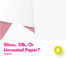
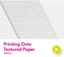
Paper Type And Lamination – Is Colour Affected?
At Aura Print, we pride ourselves on providing an absolutely stellar range of different paper stocks to print your designs. From classic silk to eco-friendly cotton, with such a diverse paper range it only makes sense for some paper types to show colour differently compared to others.
Our gloss paper, for example, reflects more light helping colours to appear more vivid. And our uncoated paper allows more ink to settle on the surface, making colours appear darker.
The same can be said for lamination. As the laminate is an additional layer over the surface of the print, a slight barrier is created between the print and the light. In turn, this can make the print appear slightly darker as less light is able to reflect from the surface.
Want To Know More About Colour In Print?
We don’t expect you to be a colour expert, after all, that’s our job!
If you do find yourself unsure about the colours in your designs, get in touch with our team. We can provide custom advice based on your designs to help you to get the best results from your paper prints.