USA
USA FR
FR
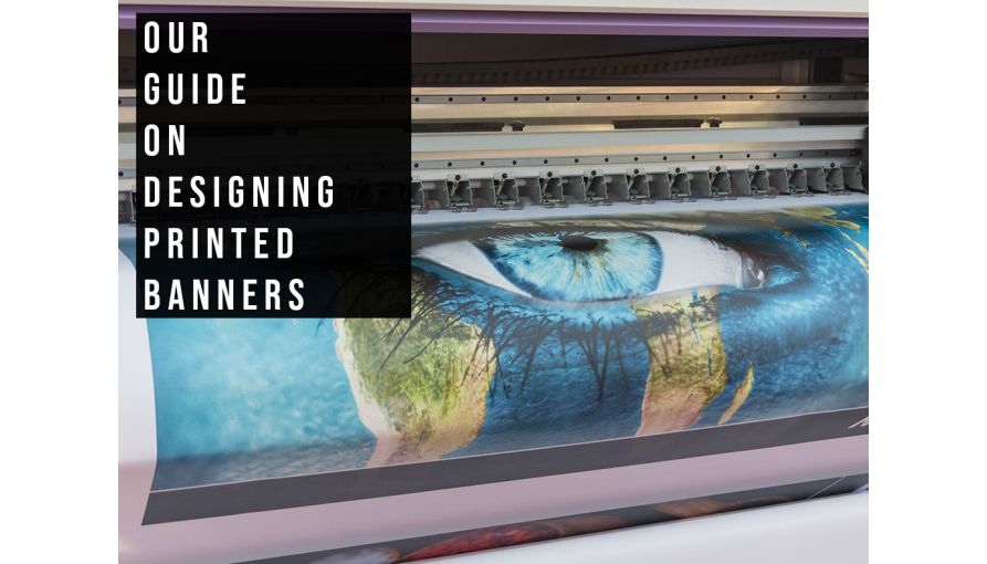
How To Design PVC Banners

We are a specialist in custom banner printing services and our printed PVC banners are among our most popular products. They combine vibrant colours and weatherproof durability with sheer, attention-grabbing size. Many of the banners we print are designed in-house by one of our designers, but we also get a lot of finished designs direct from our customers.
Over the years, our team have chalked up thousands of hours' experience in designing, printing, fitting and using banners, with a wealth of knowledge in getting the best results for our customers. And, since our team is well-versed in what to include with a banner design, they also know what's best to avoid – from both a technical and practical point of view.
This guide covers the technical aspects of using design software specifically for custom banners, as well as practical pointers to help you create a banner design that will have the desired effect.
But before we get started, it could be well worth asking yourself the following question:
Do you really want to design your own printed banner?
You see, many people attempt to design their own banners in order to get around a design fee, or so that they can get exactly what they want. On the face of it, this seems like an easy way to make a saving. However, many customers soon find that it's not as simple as opening Word and coming up with a quick design! You really do need the right software for the job. In the same way that I wouldn't service my own car just to save a little money, (because I really don't have the tools or the knowhow). Sometimes paying a professional to take care of something is actually the cheapest way – especially if you value your own time (and sanity).

It's also worth bearing in mind that to avoid the design fee for our banner service, the design you send really needs to be totally finished. Any amends will incur our design fee, as these can often take longer to do than a design from scratch, depending on how you've done the design.
Which software to use for designing banners?
It is possible to use Word or Publisher to design a banner, but it isn't easy. You'll need to know how to set your artboard to the size/proportions that your banner needs, which can be a challenge in itself. You'll also have the problem that none of these software packages use the CMYK colour space, which is essential when designing for print. You run the risk of using colours that are impossible to reproduce in print, and you'll have no way of knowing which ones are going to change the most, or which will remain unaffected.
Finally, you'll have the problem of exporting a PDF. Unfortunately we can't print directly from a Word or Publisher document – we have to export a PDF and use that instead. The problem here is that Microsoft do not fully support the PDF format, so the PDF that comes from your Word or Publisher document isn't guaranteed to look the same. Colours can change, things can move... all sorts of weird and wonderful things can happen, none of which are easy to fix.

The upshot is that you need to use professional design software, and these days the Adobe Suite is by far the most popular. You can make your design using either Photoshop, Illustrator or Indesign. Photoshop seems to be the most popular as it's the best known, and there have been cheap versions available in the past. However, the rest of the Adobe Suite is going to cost you hundreds – another reason why a small, one-off design fee isn't such a big deal!
Size, proportion and resolution of banner designs
In our experience, our studio team tend to get a lot of artwork supplied in the wrong shape. If you are designing a 6ft by 3ft banner for example, then the design needs to have a ratio of 2:1 (width to height). If this isn't right to begin with then we'd have to stretch or squash the design to fit, and this never looks good –so it's really essential that a design has the right proportions from the start.
So, first things first! When using your design software, create the document at the finished size that you'd want the banner to be. This may seem obvious, but many, many people tend to ask this question. If your banner is bigger than the 5 metre design limit of the Adobe programs, then it's best to design the banner at half size instead – so if your banner was 6m x 3m, you'd need to do the design at 3m x 1.5m. (But there's absolutely no reason at all to do your banner at half or quarter size if it's already smaller than the Adobe 5m design size limit.)
Next comes the resolution of the design. If you're using vector art software, such as Illustrator, then resolution isn't an issue. Vector art can be scaled to any size without loss of quality. However, when using a raster artwork package like Photoshop (images made up of pixels, like a large photo) then it's important to get the right number of pixels. When creating your document, set the DPI (pixels per inch) to 72. It absolutely DOES NOT need to be any higher than this.
If you're creating your document at half size (for the reasons mentioned above) then set the DPI to 150. If on a rare occasion your banner is so large that you need to create it at quarter size, then set the DPI to 300. People think that higher resolutions than this will result in a higher quality print, but the improvements really won't be noticeable from more than a few feet away.
Higher resolutions will however cause the problem of much larger files, which will certainly be too big to send as email attachments – and may even end up being too big to send via a file transfer site (such as www.mailbigfile.com)... or even fit on a CD or DVD to send in the post!
Images

If you're going to be adding images to the design, then you need to ensure that they are of sufficient resolution to look good when they are printed at the banner's full size. Images simply lifted from Google are almost never of high enough resolution to print well, so professional stock images are usually the best option.
Here at Aura Print, our studio team have an account with shutterstock.com, giving us access to millions of high-resolution images that we can use when designing a banner for you. If you're in any doubt as to how your images will look when printed, view your design on your computer screen at 100% scale – this will show things on the screen at the same size as they will be on the finished banner. If they look okay on-screen they'll look okay when printed, but if they're pixellated and blurred on screen then there's really nothing we can do to make them print any better!
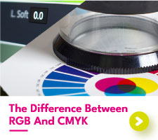
Which colour space should I use to design my banner?
This is simple – set your document to CMYK rather than RGB. (Don't forget to do this!)
Which files should I send to the printer?

If you're using a vector artwork package such as Illustrator or Indesign, then we prefer you to send a PDF. Make sure that all the fonts in the design have been changed to outlines, so there are no font issues during printing. This is actually quite easy! When your design is finished, save your Indesign or Illustrator file with a new name that indicates that it has outlined text. Drag-select your entire design and then select TYPE > CREATE OUTLINES. This changes all the text fonts into shapes. Make sure to keep your original file though, in case you need to edit the text.
If you're using Photoshop, then we prefer a JPEG file. Simply go to SAVE AS > JPEG and save the file to your computer. You can usually set the JPEG quality to medium with no adverse effects, and this will make the file size smaller and thus easier to handle afterwards.
Banner design tips
When designing anything at all, you'll need to consider how it will be viewed, and then do the design to suit. Banners have a very specific design requirement because of their size, and the manner in which they are often positioned and looked at. So, what's so special about banners?
- They are often very large
- They are often viewed from a distance
- Viewers are often moving past them in a car
- Possible viewing times are often very short.
This means that the information on a banner needs to be minimal, clear and as big as possible. If you try to include too much information on a banner, then there's a chance it will have to be made smaller to fit it all on. This will make it impossible to read from a distance, and thus a waste of time. If a banner is too wordy it will also be impossible to read in only a few seconds, and for someone zooming past in a car this may be all the time that they have.
My rule?:
KEEP IT SIMPLE.

You don't need to explain every element of your business or event. You also don't need three or four different pieces of contact information. You don't need five pictures, where one big one will have much more impact.
Let's look at an example brief below. It's a very typical example of the kind of brief we get from customers when they want us to design a large banner for them. (Let's say that it's a 8ft by 2ft banner).
- Dog grooming picture to the left and right ends of the banner
- Heading – Big Muddy Paws Dog Grooming Services
- Services List – Dog Shampooing | Coat Trimming | Claw Cutting | Dog Walking Service
- Text – "We cover all aspects of dog grooming with quality services at competitive rates. Why not bring your beloved pet in today for the attention that he or she deserves!"
- Contact Details – 123 Address Street, Townton, West Countyshire AB1 2CD
- Tel: 00000 000000 / 00000000000
- Fax: 00000 000000
- Email: info@bigmuddypaws
- Website: bigmuddypaws.co.uk
- Find us on Facebook at www.facebook.com/bigmuddypaws
If that was the info for an A5 flyer, it would be absolutely fine. For a banner however, it's far too much information to be read and understood in a short amount of time, and from a distance. Let's look at what a much better brief would be:
- Dog grooming picture to the left of the banner
- Heading – Muddy Paws Dog Grooming Services
- Services List – Dog Shampooing | Coat Trimming | Claw Cutting | Dog Walking Service
- Contact – Townton based www.bigmuddypaws.co.uk
As you can see, there is much less information here. Only having one picture will mean that the text has more space, so it can be bigger – and having less text overall will mean that it can be bigger again. It'll also be less confusing, and so you'll be able to read the banner's key points in only a few seconds. The web address is basically all you need, since anyone who needs your services can look at your website, where you can have all your other details for them to browse at their leisure.
So, when designing your printed banner try to think of what you can leave out, rather than trying to cram as much in as possible. Think fewer, stronger design elements that will have an impact in a short time, and at a distance. It's far better to create an impact and raise interest, so that people can then visit your website and find out more. If you create a banner that has all the information on, but cannot be seen at a distance or read in a few seconds, then you might end up attracting nobody at all!
We hope this guide helps you when it comes to designing your very own printed banner, but if you have any questions then our team are always happy to tell you more.
Outdoor Banner Tips
If you are designing your banner for outdoor use, remember that mesh banners are windproof. If you are unsure which type of PVC to pick, please read our article 'The Best Material For Outdoor Banners' which explains why a mesh vinyl is a better choice for a large banner or a windy location.
Our article 'How To Hang A Banner Outside' includes information about planning permission as well as details about the best fixings to use.